Colourful Geometric Art for Modern Interiors – Abstract Paintings and Canvas Prints into Contemporary Interiors
Table of Content
Step into a room dominated by beiges and greys, and you might notice a sense of neutrality – safe, predictable, and perhaps comfortable, yet ultimately forgettable. Now, picture the same space with a striking piece of colourful geometric art commanding the main wall. Instantly, the room comes alive, infused with personality, energy, and movement through vibrant contemporary art.
This guide discovers how to select and display colourful geometric art for modern interiors, offering practical tips for homeowners and interior designers seeking to enhance their spaces with vibrant, structured artwork. Whether you’re looking to refresh a living room, energize a workspace, or create a focal point in a dining area, this article can help. It explains the impact of variety of geometric motifs in artworks.
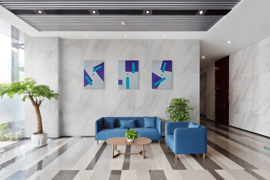
How Vibrant Geometric Art Enhances Interiors
Vibrant geometric art transforms interiors by adding colour, movement, and contemporary appeal. Its structured patterns and vivid tones draw attention, elevate the design, and give rooms a confident, modern character.
#1 Personal Expression and Transformative Impact
Discovering a favourite piece from a curated collection can transform a space while reflecting your personality. It might become your new favorite piece and the focal point of your room. Colourful geometric art brings together individual expression and functional beauty in home décor. When chosen thoughtfully, these pieces can elevate a plain interior into a mood-lifting environment.
#2 The Role of Colour and Framing
Colour and framing play a crucial role in the impact of artwork within a space. The right colours can set the tone of a room, evoke emotion, and complement existing décor, while thoughtful framing enhances the artwork’s presence and protects it over time. Together, they ensure that each piece not only stands out visually but also integrates harmoniously into the interior, creating a cohesive and engaging environment.
#3 Structure, Harmony, and Emotional Balance
Modern interiors benefit from geometric compositions where clean lines and structured patterns keep bold colours organized. Shapes like triangles, squares, and circles create a sense of control, while dynamic colours add emotional impact – a balance of structure and spontaneity that enhances any room.
#4 Inspiration from Nature and Global Design
Geometric works draws inspiration from natural forms such as coastlines, pebble stacks, and beach scenes.
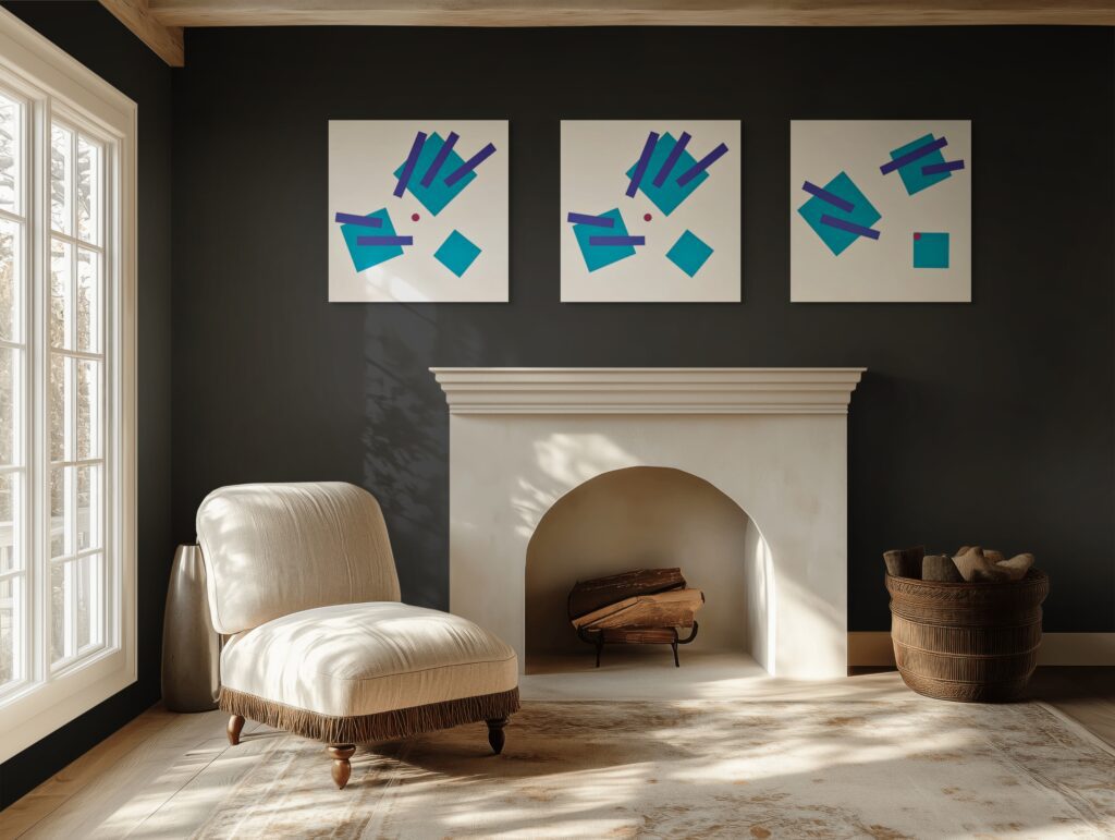
Historical Movements and Influential Artists
Geometric works has evolved through various movements and the work of pioneering artists, each contributing unique approaches to form, colour, and visual perception. Some of movements are listed below:
- Op Art – Bridget Riley, Victor Vasarely: Focused on rhythmic patterns to evoke optical illusions and movement, engaging viewers’ perception and developing dynamic visual effects.
- Bauhaus / Modernist Geometric Abstraction – Josef Albers : Bauhaus aimed for a universal visual language by integrating geometric principles into art and design. It explored colour interactions within geometric forms in his Homage to the Square series, showing how simple shapes can develop complex visual effects through colour relationships.
- De Stijl – Piet Mondrian, Theo van Doesburg: De Stijl artists emphasised pure abstraction, using horizontal and vertical lines alongside a restricted colour palette. Primary colours set against black and white backgrounds provided striking visual impact, conveying a sense of balance and harmony. Piet Mondrian, in particular, is renowned for his grid-based paintings, featuring bold black lines and blocks of primary colour, which became emblematic of the movement’s pursuit of order and clarity in art.
- Suprematism – Kazimir Malevich: Focused on pure feeling through simplified geometric shapes, prioritizing emotional and spiritual expression over representation.
- Abstract Expressionism / Geometric Abstraction – Wassily Kandinsky: Wassily Kandinsky developed dynamic compositions using circles and triangles inspired by music to evoke emotion and rhythm, bridging geometric abstraction with expressive content.
Here’s a simplified table focused only on movements most directly tied to geometric abstraction for quick reference:
Movement / Style | Key Artists | Key Features | De Stijl | Piet Mondrian, Theo van Doesburg | Grid-based abstraction, primary colours, horizontal and vertical lines |
|---|---|---|
Suprematism | Kazimir Malevich | Simplified geometric forms, focus on pure feeling |
Bauhaus / Geometric Abstraction | Josef Albers | Colour interaction studies, clean geometric shapes |
Op Art | Bridget Riley, Victor Vasarely | Optical illusions, rhythmic geometric patterns |
Constructivism | Vladimir Tatlin, El Lissitzky | Geometric forms with structural and functional focus |
Minimalism | Donald Judd, Frank Stella | Simplified shapes, repetition, focus on colour and space |
Hard-Edge Painting | Ellsworth Kelly, Kenneth Noland | Crisp, flat geometric shapes with sharply defined edges |
By connecting artists to their movements, it becomes clear how different schools of thought influenced geometric abstraction, from optical illusions to colour theory and abstract emotional expression.
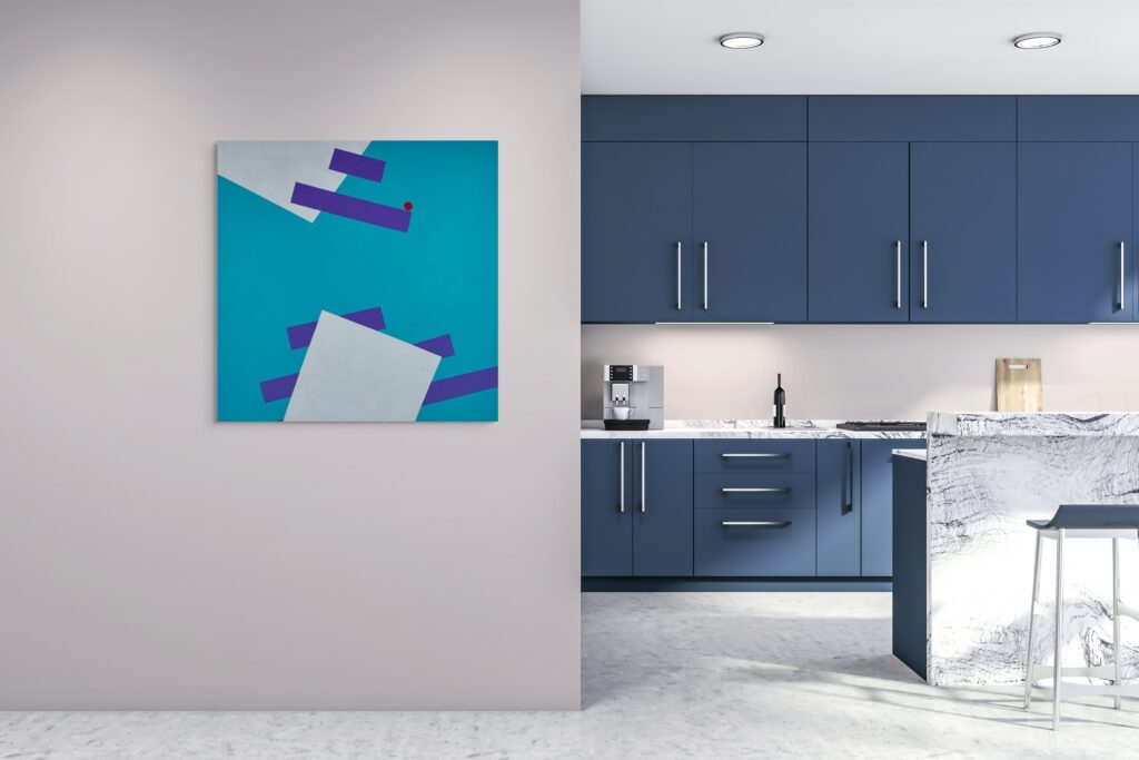
Psychology of Colourful Geometric Art: Paintings, Canvas Art and Wall Decor in Interior Spaces
Geometric abstraction uses mathematical shapes arranged in deliberate patterns to create non-representational compositions. It often features clean lines and dynamic forms that capture attention and evoke visual interest.
Colour has a profound effect on us at a physiological level, influencing heart rate, hormone production, and brain activity. It can shape the mood and atmosphere of a space, making it an essential consideration when selecting abstract wall art or home décor. Understanding these effects allows you to choose pieces that create the exact atmosphere you desire.
Colour meanings:
- Blue: Calming and stabilising – reduces stress and promotes focus.
- Green: Restorative and balancing – encourages relaxation and renewal.
- Yellow: Uplifting and stimulating – boosts optimism and alertness.
- Orange: Energising and warming – encourages sociability and motivation.
- Red: Activating and intense – increases energy and arousal.
- Purple: Reflective and imaginative – supports creativity and introspection.
- Neutral tones: Grounding and calming – provide balance and visual rest.
#1 Energising Yellows
Warm, bright colours stimulate mental activity and boost energy. Yellow, the colour of sunshine, naturally enhances optimism, making it ideal for abstract paintings and geometric wall art. Orange combines the vibrancy of yellow with the passion of red, creating warmth and enthusiasm without appearing aggressive – perfect for line-art compositions.
These hues work exceptionally well in spaces where motivation and creativity are important, such as home offices, studios, kitchens, workout areas, or workplaces. A piece featuring bold orange shapes can provide a morning energy boost even more effectively than coffee, while complementing mid-century modern décor or metallic wall-art accents.
#2 Vibrant Teals
Bright blues and teals present an intriguing paradox: they are both energising and calming. Unlike soft pastels, which soothe, vivid teals and turquoise promote focus while maintaining a sense of clarity and control. In modern abstract wall art, these colours convey focused energy rather than frenetic activity.
#3 Bold Purples
Purple bridges warm and cool tones, combining the energy of red with the calm of blue. In brighter shades such as violet, magenta, and fuchsia, it becomes bold and expressive, strongly associated with imagination and individuality. In minimalist wall art and design, purple brings a striking and distinctive presence.
Vibrant purple compositions make powerful statements in common spaces and creative environments. They are distinctive enough to feel unique, yet refined enough to remain sophisticated.
If you’re curious to explore these ideas further, take a look at The Sensation Triptych and my selection of single pieces below. Each work is designed to bring colour, balance, and individual feeling into your space, whether you’re drawn to bold statements or more refined accents.

Sensations: Sparks
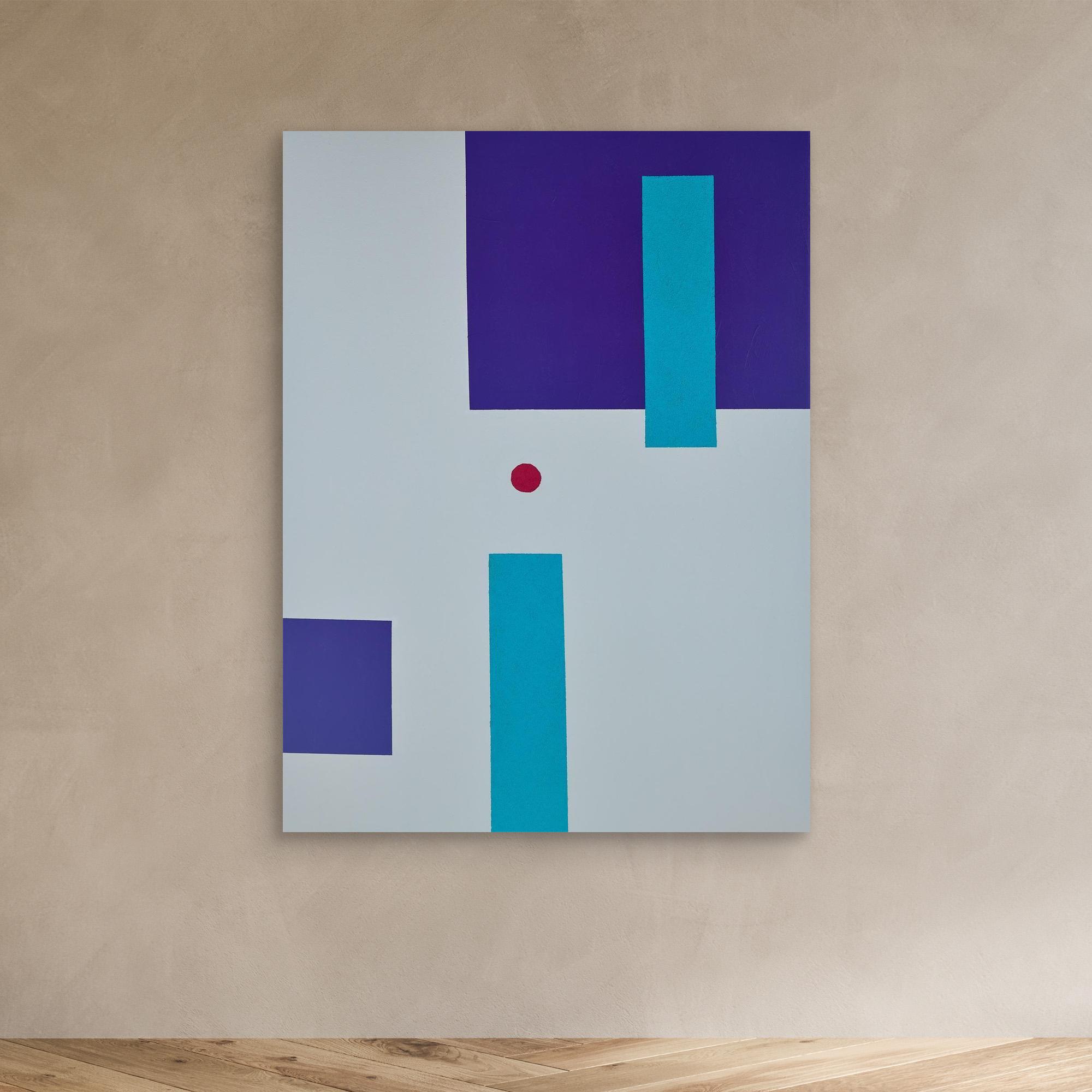
Sensations: Pulses

Sensations: Echoes
#4 The Red Accent
In abstract and modern geometric wall art, large areas of red can feel overwhelming, but carefully placed accents create striking focal points. A small pop of warm colour draws the eye and adds a human touch to the composition. In geometric art print collections and original canvas paintings, red acts like visual punctuation, energising the piece and preventing it from feeling too cool or detached.
The table below summarises each colour and its psychological effects, showing how different hues in geometric and abstract art influence mood, energy, and focus in interior spaces.
Colour | Psychological Effect | Emotional Response | Best Used In | Blue | Calming, stabilising | Reduces stress and promotes focus | Bedrooms, studios, healthcare spaces |
|---|---|---|---|
Green | Restorative and balancing | Encourages relaxation and renewal | Living rooms, workspaces, wellness areas |
Yellow | Uplifting and stimulating | Boosts optimism and alertness | Kitchens, creative zones, social spaces |
Orange | Energising and warming | Encourages sociability and motivation | Entryways, gyms, collaborative areas |
Red | Activating and intense | Increases energy and arousal | Accent walls, dining spaces (sparingly) |
Purple | Reflective and imaginative | Supports creativity and introspection | Meditation rooms, artistic studios |
Neutral tones | Grounding and calming | Creates balance and visual rest | Any space as a foundation colour |
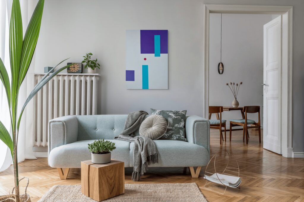
Materials for Artistic Expression
Modern geometric abstraction uses a wide range of materials and techniques. Each contributing texture, colour depth, and visual impact. Artists select their mediums to achieve specific effects, from bold statement pieces to subtle, mood-enhancing accents. Key materials and methods include:
- Resin: Creates a high-gloss, glass-like finish that enhances colour vibrancy and allows embedded elements such as metallic flakes or pigments, adding depth and dimension.
- Canvas: Provides a classic painting surface, ideal for layered brushwork and acrylic techniques. MDF and wood panels offer smooth, stable alternatives suited to sharp lines and precision.
- Acrylic paints with masking or painter’s tape: Enable hard-edge painting with crisp, clean-edged shapes and controlled colour contrast.
- Vinyl tape: Widely used in street art and murals to achieve clean geometric patterns and bold linear designs.
- Mixed media and unconventional surfaces: Incorporate materials such as metal, glass, sand, or fabric to introduce tactile interest and dynamic effects.
- Digital printing and high-quality canvas prints: Allow geometric designs to be reproduced with consistent colour accuracy and sharp detail, making modern art accessible for interior décor.
Understanding these materials helps art collectors, homeowners and designers choose artworks that suit their interiors.
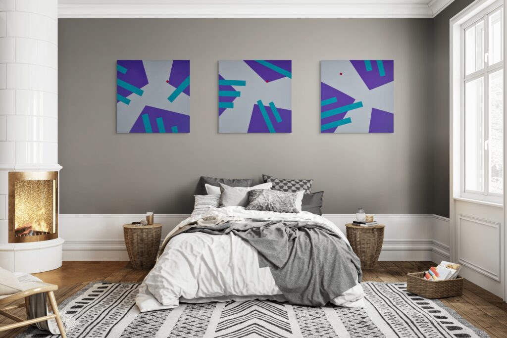
Choosing Vibrant Pieces for Your Gallery Wall
Not all vibrant artworks suit every space. The key is understanding how to use colour within structured designs. Whether in abstract minimalist or geometric wall décor, to achieve a sophisticated, cohesive aesthetic.
The most striking pieces often feature high-contrast colour palettes and precise techniques that create crisp, clean lines. Digital design software like Adobe Illustrator allows for perfect precision and vibrant colour palettes in geometric art.
Selecting the right frames, particularly high-quality, handmade options in various materials, can further enhance the vibrancy of the artwork, showcasing it to its full effect and elevating your home décor.
#1 Pattern Complexity and Bauhaus Influences
Simple patterns paired with vibrant colours provide a bold, graphic impact, reminiscent of Mondrian or Bauhaus aesthetics. Abstract metal wall pieces benefit from this approach, where colour takes centre stage. Clean, structured patterns provide form, while lively hues inject personalit.
More complex designs, featuring layered shapes, overlapping forms, or intricate compositions, require a slightly more restrained approach to colour. In boho-inspired wooden wall art or contemporary modern displays, moderating the intensity of bright hues prevents visual overwhelm, allowing the pattern itself to remain the focal point and maintaining balance.
#2 Colour Proportion and Artful Balance
You do not need every element to be vibrant to energise a space. Often, the most effective artworks use colours strategically within predominantly neutral compositions. For example, a grey-and-white geometric canvas with blue accents can have greater impact than an entirely blue piece, as the contrast allows the colour to “pop.”
Aim for artworks in which colours occupy roughly 30–50% of the composition, with neutral tones providing balance and grounding. This approach works well across orange geometric pieces, Nordic-inspired modern designs, and metallic wall art, adding energy without overwhelming a modern minimalist interior.
#3 Scale and Impact
Colours read better across distance than muted tones, making them ideal for focal points in larger rooms. For instance, a 48-inch triptych in bold colours commands attention in a living room, whereas the same piece in pastels may fade into the background.
Consider sightlines carefully when positioning colourful artworks. Place them where they are immediately visible from main seating areas or entry points, allowing the energy and visual impact of the piece to be felt as soon as someone enters the space.
#4 Texture and Finish
The texture and finish of an artwork can dramatically affect how its colours are perceived. Gallery-wrapped canvases provide subtle texture, softening vibrant tones and preventing them from appearing harsh. Matte finishes give colours a rich, sophisticated quality, particularly in geometric abstraction.
Original acrylic paintings add further depth, with visible brushstrokes introducing a hand-crafted, tactile element. In geometric line art or wooden wall installations, this ensures colourful displays feel dynamic and human rather than digitally perfect or sterile, enhancing the overall refinement of abstract geometric décor.
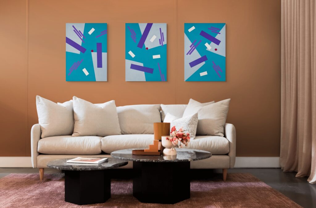
Where to Place Vibrant, Abstract Wall Art
Location is crucial when working with patterned, colourful artworks. To maximise their effect, hang pieces at eye level and take the overall interior design of your space into account. Improper placement can make even the most striking artwork feel jarring or overwhelming. Position artworks thoughtfully to ensure they enhance the room and elevate the entire space.
#1 Living Room Focal Points
- The wall behind or opposite your main seating area is prime for colourful abstract pieces in subtle, sophisticated tones such as sage green. This is where the eye naturally rests during conversation or relaxation.
- A vivid triptych in this position can serve as the room’s anchor, around which all other design elements revolve, making it a striking statement piece.
- Keep surrounding walls and large furniture pieces relatively neutral to allow the artwork to define the colour scheme. The display should tell the colour story, rather than competing with patterned sofas or busy wallpaper.
#2 Hallways and Transitional Spaces
- Hallways are often overlooked in home design, yet they provide an ideal opportunity for colourful displays, whether through gallery walls or individual art arrangements.
- These transitional spaces benefit from energy and personality, and because they are viewed briefly, even bold pieces work well.
- A striking composition can transform a plain hallway into a gallery-like experience, making the journey from room to room feel deliberate and engaging rather than purely utilitarian.
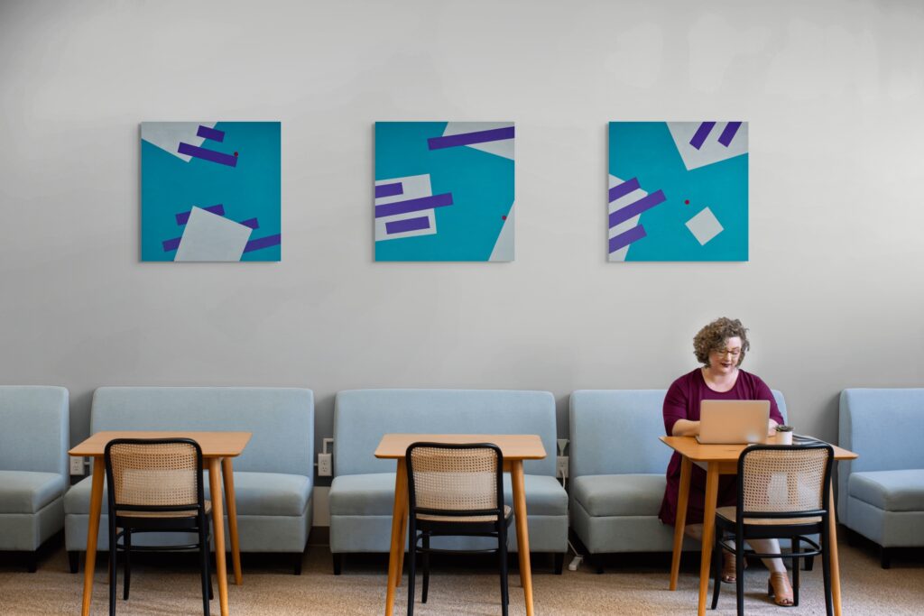
#3 Home Offices and Creative Spaces
- Spaces dedicated to productivity and creativity benefit from colour stimulation through wall art.
- Colourful collection in home offices provide visual interest that enhances focus, offering a resting point for the eyes that is more engaging than blank walls but not as distracting as external views.
- Position collection pieces within your peripheral vision while working. This allows you to enjoy the psychological benefits of colour without interrupting concentration during focus sessions.
#4 Kitchens and Dining Areas
- Social spaces lend themselves well to colourful artworks, as the energy of the pieces complements the room’s function. Black geometric prints or beige-toned canvas art can add sophistication while maintaining visual interest.
- A striking artwork in the dining area or kitchen can enhance conversation and even stimulate appetite. Warm colours, such as oranges, reds, and yellows, have been shown to encourage social interaction and increase appetite.
- When placing artwork in these spaces, ensure it is positioned away from cooking areas, where grease and steam could cause damage over time.
#5 What to Avoid
- Avoid highly energising pieces in bedrooms if you struggle with sleep, even when using neutral or botanical geometric designs. Colours and patterns that invigorate living areas can interfere with relaxation in sleeping spaces.
- Similarly, steer clear of intense or highly stimulating compositions in meditation corners or quiet reading nooks, where the aim is to cultivate calm and focus.
- Be cautious when placing vivid wall pieces in rooms with abundant natural light. Excessive light can make strong colours feel overwhelming, particularly at midday. Such displays are better suited to spaces with more controlled lighting.
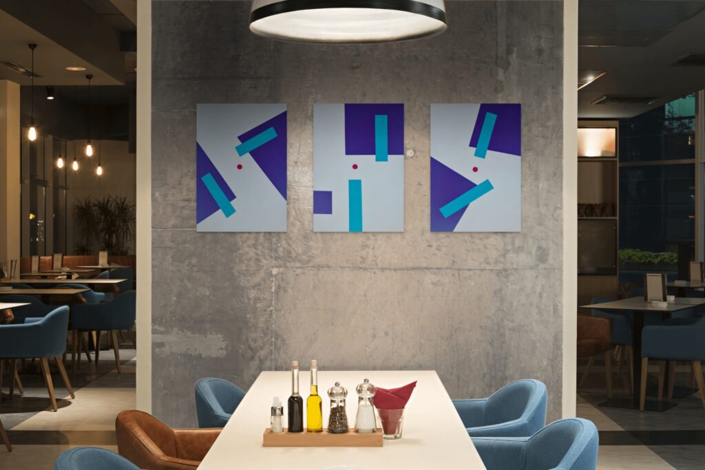
Bringing It All Together: Colourful Geometric Art in Modern Interiors
Incorporating colourful, patterned pieces into your home allows you to combine style, energy, and personality in a single statement. Selecting from a geometric art prints collection or a curated series of original canvases can create a cohesive, sophisticated look, enhancing both structure and visual interest in modern interiors. Abstract paintings and canvas prints can transform walls into dynamic focal points, balancing vivid tones with contemporary décor elements and elevating the overall atmosphere of a space.
#1 Achieving Visual Harmony
By carefully selecting pieces that complement your space, taking into account pattern, colour proportion, scale, and texture, you can create interiors that are both visually engaging and harmonious. Whether through bold geometric shapes, layered abstract forms, or subtle colour accents, these art pieces introduce sophistication, creativity, and a sense of individuality to modern living spaces.
#2 Statement Pieces and Modern Atmosphere
Colourful patterned prints can serve as statement pieces in residential and commercial interiors, drawing the eye and anchoring the space. The use of vivid tones in abstract designs enhances visual interest and helps create a contemporary, modern atmosphere across a variety of spaces.
#3 Practical Tips for Homeowners and Designers
- Select high-contrast colour palettes and precise techniques to achieve crisp, defined results.
- Choose high-quality frames to complement and showcase your pieces.
- Position statement pieces thoughtfully to maximise their impact and create a cohesive, balanced interior.
🖼️ Quiz: Colourful Geometric Art for Modern Interiors
Test your understanding of using colour, pattern, and structure to transform contemporary spaces.
Question 1 of 3
What is one key benefit of incorporating colourful geometric pieces into modern interiors?
When choosing colours for geometric prints or abstract canvases, which approach is recommended to ensure a timeless look?
Which interior spaces are generally best suited for colourful geometric designs?
Summary About Colourful, Abstract Art
Colourful patterned pieces bring energy, structure, and personality to modern interiors. Abstract paintings and canvas prints featuring bold shapes and dynamic tones enhance mood, create focal points, and introduce harmony to living spaces, offices, and contemporary homes. Drawing inspiration from nature, global design, and iconic art movements, these pieces combine visual appeal with emotional impact, making them an ideal choice for stylish, engaging interiors.
Ready to Elevate Your Office with Striking Abstract Paintings?
Transform Your Space with Uplifting Art
Browse my collection of mood-boosting geometric paintings.
FAQ - Frequently Asked Questions

Unlocked. Congratulations!
Use code ADRA10 at checkout.
Only available the next 1 hour.
Your Discount for Mood-Boosting Art is Waiting
Enter your email to unlock your one-time discount.
By signing up, you’ll receive curated emails with early collection access and interior art styling tips. Unsubscribe anytime.