Psychology of Colour in Art and Interior Design: Creating Users Mood and Interiors Ambiance
Table of Content
Are you a homeowner, artist, or interior designer seeking to create spaces that truly support mood, wellbeing, and personal expression? This comprehensive guide explores the psychology of colour in art and interior design, providing actionable insights for anyone interested in shaping ambiance and emotional experience through visual choices. Whether you’re selecting artwork for your living room, planning a home renovation, or designing a creative workspace, understanding how colour works is essential for achieving your goals.
This article covers both the artistic and interior design applications of colour psychology spectrum, offering practical advice, research-backed facts, and real-world examples to help you make informed decisions and how to use this powerful interior design tool.
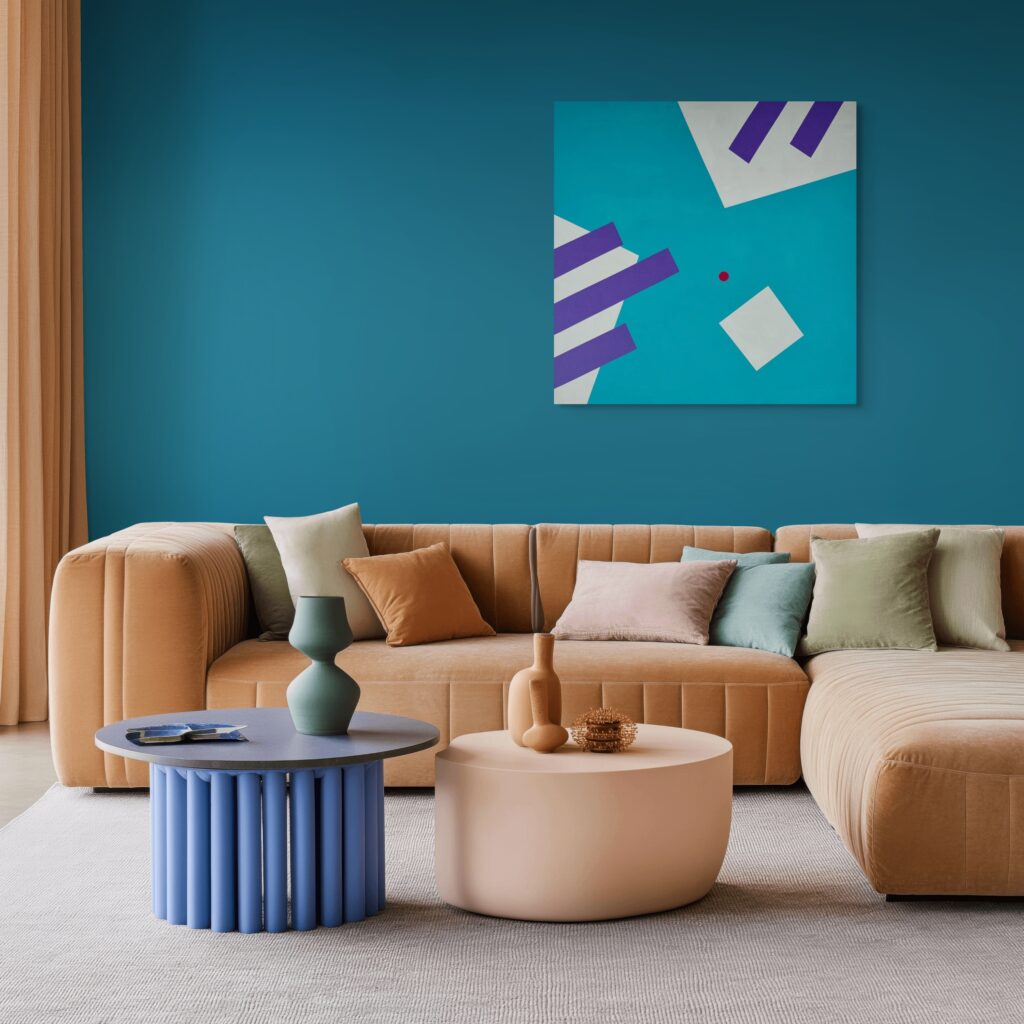
Understanding the Psychology of Colour in Art and Interior Design
Colour psychology studies how different colours influence human behaviour, mood, and perception. By applying these principles, you can intentionally craft environments that energise, calm, inspire, or comfort.
Environmental psychology sits at the intersection of what I do on canvas and what happens when that canvas hangs in someone’s living room or office. This field studies how physical surroundings, including colour, form, and spatial arrangement, shape human behaviour, emotional responses, and cognitive function.
The science begins with basic biology. When light enters our eyes, cone cells interpret wavelengths reflected by objects, translating physics into perception. But what happens next is where colour psychology becomes fascinating: that biological signal triggers emotional and psychological effects that influence everything from blood pressure, evoking emotions to creative thinking.
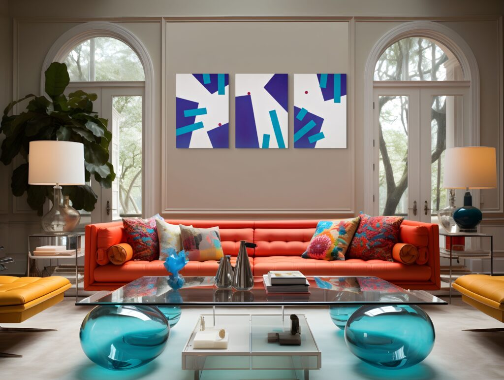
The Emotional Impact of Colour Choices: How Visual Environment Affects Mental State
The spaces we inhabit are not neutral containers. They actively participate in shaping our mental states throughout the day. Research in interior design psychology demonstrates that certain colours in interior design can lower perceived temperature in a room, while others increase perceived warmth. This isn’t imagination. It reflects genuine shifts in how our nervous systems respond to environmental stimuli.
Thoughtful use of colour in interior design can shape both a space’s appearance and its function, influencing daily habits and overall mood. A single geometric canvas featuring royal blue and dark green tends to encourage quieter speech, slower breathing, and increased focus among viewers. In contrast, artworks with bold orange and red hues in an office corridor have been associated with faster walking and descriptions of the space as “energizing.”
The colour perception process involves more than just seeing. It triggers cascading physiological responses and evokes specific emotions:
- Cool colours tend to slow heart rate, lower blood pressure and create a calming effect. For example: green is associated with nature, energy, and balance, and is known to have a calming effect. Blue is linked to feelings of calmness and trust, and is often used in spaces designed for relaxation.
- On one hand warm tones can increase alertness and social engagement, on the other warm colours such as red, orange, and yellow evoke energy, passion, and excitement, making them ideal for social areas. Red is often linked with passion and energy, and can increase heart rate and create a sense of urgency. Orange is associated with warmth and creativity, and can promote social interaction.
- Pink is associated with compassion and calmness, and is often used in environments meant to soothe and nurture.
- Purple is linked with creativity and luxury, and can evoke feelings of sophistication and mystery.
- Neutral tones provide visual rest and reduce cognitive load.
- Bright colours draw attention and can provoke emotional responses.
Interior designers increasingly recognise that colour in interior design affects not just aesthetics but measurable outcomes in productivity, relaxation, wellbeing and social interaction.
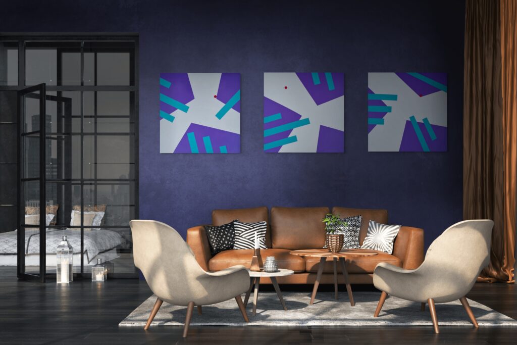
The Subliminal Power of Daily Art Exposure and Colour Perception
Most people don’t consciously analyse the art on their walls. Yet that art works on them continuously, shaping mood, influencing productivity, and contributing to their overall sense of wellbeing. This subliminal power makes colour in interior design one of the most underutilised tools for emotional management.
When I place a geometric painting in a client’s home, I’m essentially installing a mood device. The chosen hue combinations, the proportions of warm versus cool, the interplay of lighter shades against darker areas. All of these elements send continuous signals to the viewer’s subconscious.
Studies have shown that exposure to attractive shades of green and blue can reduce stress markers, while living spaces dominated by harsh, unrelieved yellows may increase agitation over time. The key insight is that this exposure is cumulative. A single glance at a painting matters less than the thousands of peripheral glimpses accumulated over months of daily life.
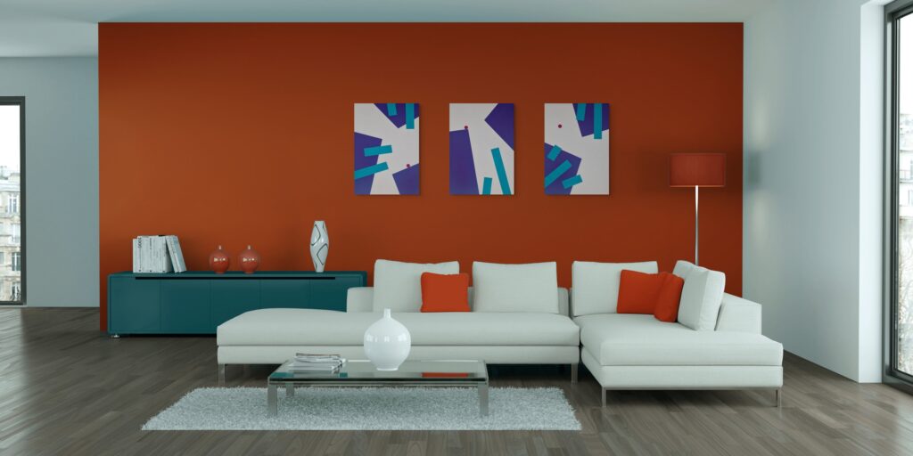
Research on Art and Colour Therapy and Healing
Colour therapy extends beyond aesthetics into documented therapeutic applications. Clinical research has demonstrated that carefully selected colour combinations can support healing environments in hospitals, reduce anxiety in dental offices, and improve focus in educational settings.
The evidence base for how different hues affect healing continues to grow:
Environment | Recommended Colours | Psychological Effect | Hospital rooms | Soft greens, pale blues | Reduced anxiety, lower perceived pain |
|---|---|---|
Therapy offices | Warm neutrals, muted ochres | Safety, openness to conversation |
Recovery spaces | Lavender, sage | Restfulness, emotional regulation |
Rehabilitation gyms | Coral, warm orange | Motivation, energy |
This research informs approach to geometric art, where chosen hues and colours, isn’t just creating visual interest but designing emotional experiences.
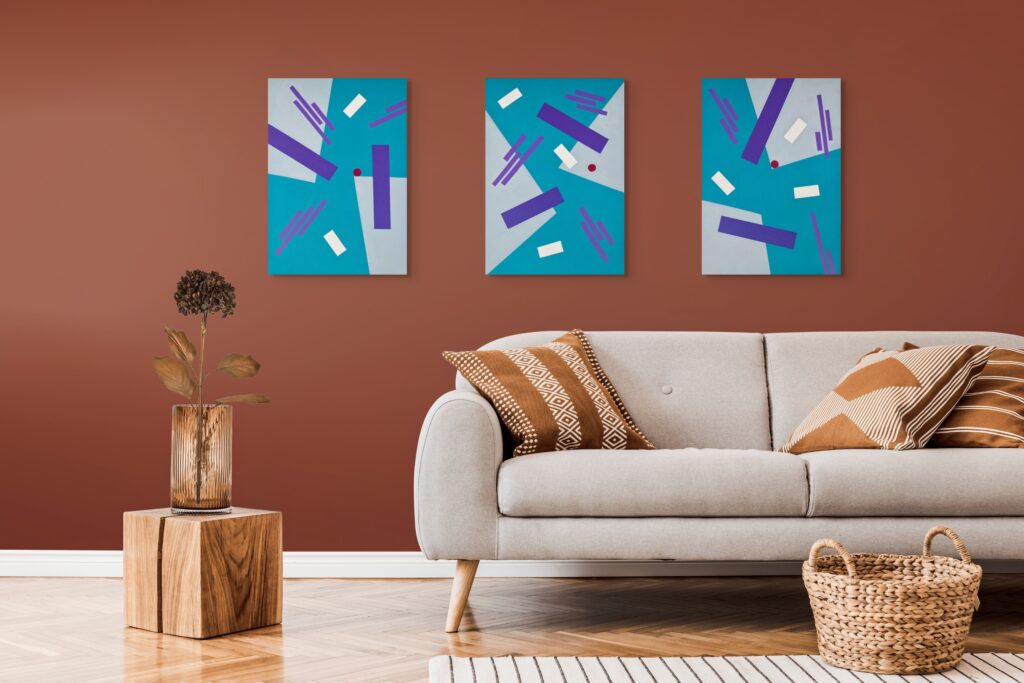
Colour Psychology in Interior Design
Interior design colour psychology bridges the gap between scientific research and practical application. When we approach a room with a large geometric composition where every surface carries psychological weight. The walls, ceiling, floor, and furnishings each function as planes in a painting, and the colour choices for each determine how the entire room feels.
#1 Understanding the Colour Wheel and Colour Scheme Types
The colour wheel is a foundational tool for understanding how colours relate to one another. It helps designers and artists create harmonious or dynamic effects by selecting colours based on their positions on the wheel.
- Monochromatic schemes use variations of a single hue for a cohesive, calming effect.
- Analogous schemes combine colours that sit next to each other on the wheel, creating natural harmony.
- Complementary schemes pair colours opposite each other, resulting in high contrast and energy.
- Triadic schemes use three evenly spaced colours for a vibrant, balanced look.
Strong colour schemes are central to effective interior design, enabling designers to shape balanced spaces and intended moods.
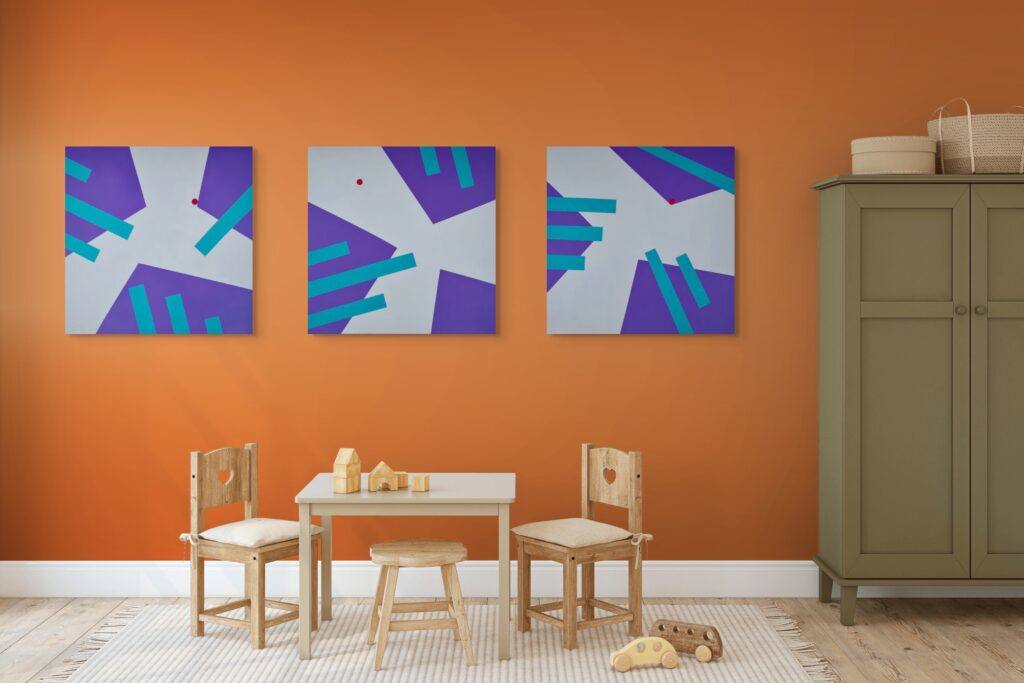
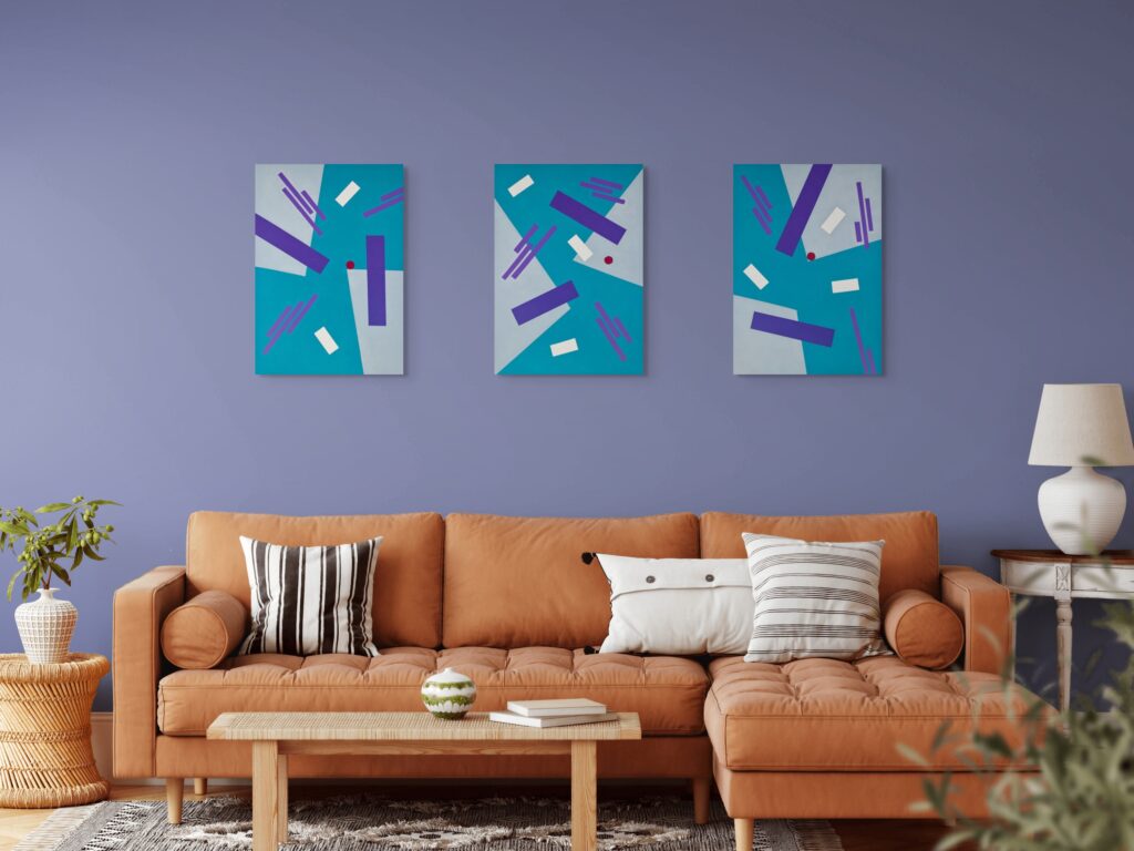
You can experience “Gravity” as a complete triptych for a bold, immersive impact, or choose a single piece to bring a quieter sense of balance into your space. Each option offers its own presence, whether you want a strong visual statement or a subtle, grounding accent to live with every day.
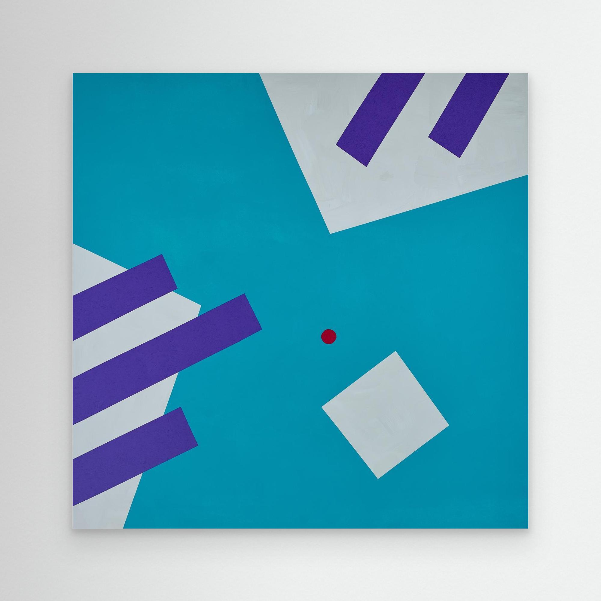
Gravity: Uplifting

Gravity: Pulling
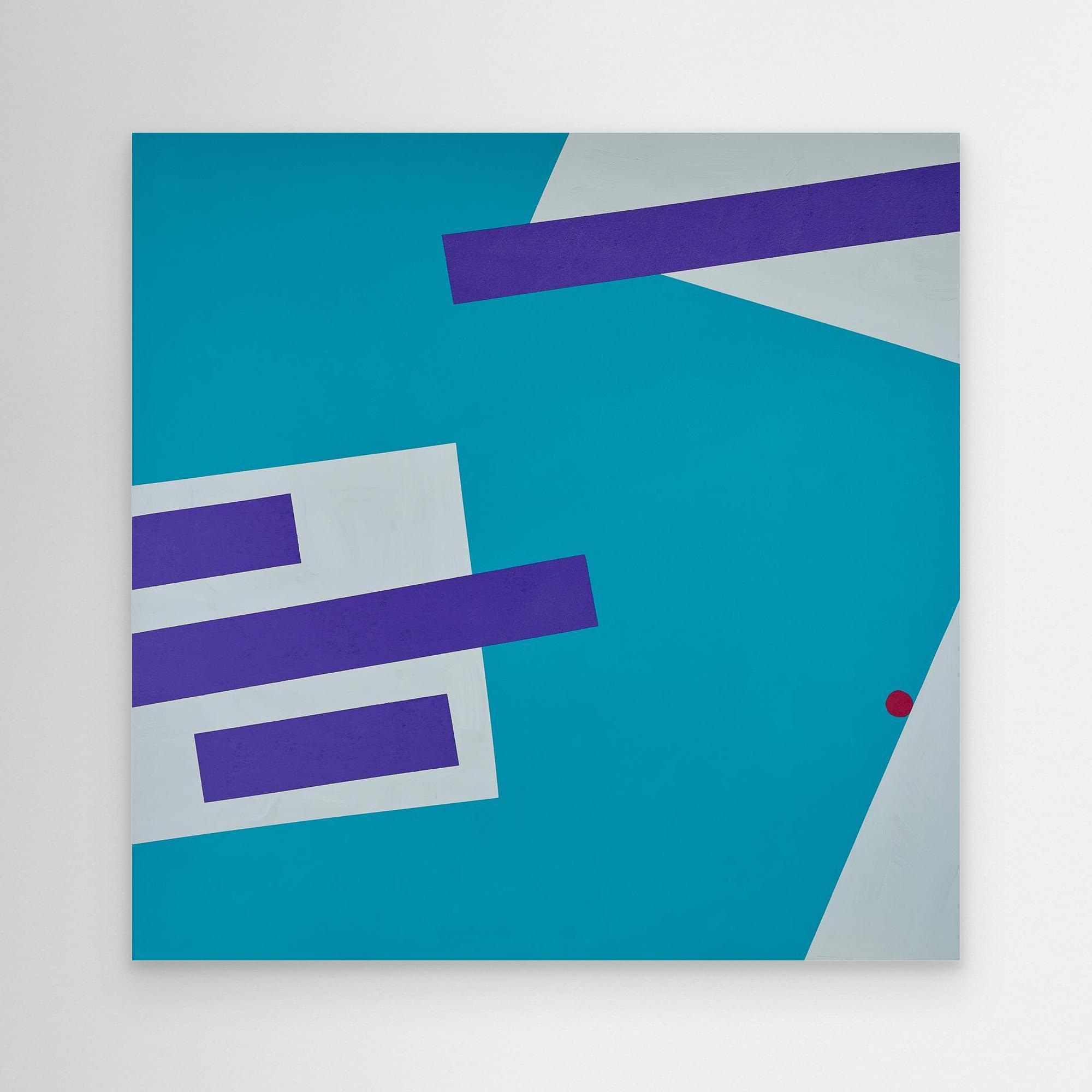
Gravity: Propelling
#2 Warm vs. Cool: Temperature and Emotion
The fundamental division in colour theory separates warm and cool colours. This isn’t merely a classification, it reflects genuine differences in how these colours affect our mood and behaviour.
Warm colours (reds, oranges, golden shades, most yellows):
- Increase perceived room temperature
- Stimulate appetite and social interaction
- Create a cosy and welcoming atmosphere
- Encourage movement and activity
- Work particularly well in dining rooms and social gathering spaces
Cool colours (blues, greens, purples, blue-greys):
- Lower perceived temperature
- Support concentration and reflection
- Create depth and spaciousness
- Promote calm and measured thinking
- Suit bedrooms, bathrooms, and study areas
A table summarising the psychological effects of warm vs. cool colours perception:
Colour Type | Psychological Effects | Best Room Types | Warm | Energising, social, increases appetite, cosiness | Dining rooms, kitchens, living rooms |
|---|---|---|
Cool | Calming, focused, spacious, restful | Bedrooms, bathrooms, offices |
#3 Saturation and Intensity Effects
Beyond temperature, saturation dramatically alters how a colour functions psychologically. A pale, dusty rose behaves entirely differently from a saturated magenta, even though both are technically “pink.”
Lighter hues:
- Open up spaces visually
- Feel more calming and less demanding
- Work well across large surface areas
- Create a sense of airiness
Vibrant and bold colours:
- Demand attention and create focal points
- Work best as accent colour choices
- Can overwhelm if used across an entire room
- Add drama and personality
I often advise clients to use the 60-30-10 approach:
- 60% of the room in a dominant colour (usually more muted)
- 30% in a secondary tone
- 10% in intense accents
This mirrors how I structure my geometric compositions. Large fields of neutral colours or softer tones, punctuated by smaller areas of intense, vibrant colours that carry the emotional weight.
Natural light significantly affects how saturation reads in a space and interior design. A colour that looks perfect under gallery lighting may appear completely different in a north-facing living room with grey skies outside.
#4 Cultural Colour Associations and Personal Response
While biology explains some colour responses, cultural background heavily shapes others. Red signals danger in some Western cultures but represents prosperity and celebration in Chinese tradition. White reads as pure and peaceful in many European contexts but signals mourning in parts of South Asia.
These variations remind that colour psychology isn’t a rigid formula. When I work with clients, I ask about their personal colour history:
- What colours dominated your childhood home?
- Are there colours you associate with specific memories or people?
- Have you lived in cultures with different colour associations?
- Are there colours you instinctively avoid?
Personal response often trumps general principles. If a client has negative associations with yellow from a difficult period in their life, no amount of research about yellow’s cheerful properties will make it the right colour for their bedroom.
This is why I view colour theory as a starting point for conversation rather than a prescription. The principles help narrow options and explain likely effects, but individual testing and personal response remain essential.
Now that we’ve explored how colour influences mood and function in interiors, let’s examine how geometric forms interact with colour to shape psychological responses.
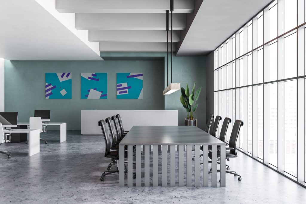
The calming effect of blue in bedrooms has solid research support. Test layered blue colour schemes, lighter shades on walls, deeper tones in textiles, with art that echoes these blues alongside warm accent colour touches to prevent coldness.
Dark shade of green in a reading corner creates focus and reduces eye strain. Combined with warm colours of wood tones and soft, natural lighting, it produces an environment where extended concentration feels natural rather than forced.
Geometric Forms and Psychological Response
Beyond colour, shape itself carries psychological meaning. As a geometric abstract painter, I’ve observed that certain colours work with certain forms to amplify or moderate their effects. Form and colour together create more complex emotional experiences than either alone.
#1 Circles: Completeness and Harmony
Circular forms evoke completeness, protection, and natural cycles. They lack the tension of corners and the direction of arrows. In my paintings, I use circle or arc when I want to create a focal point and centre of composition.
Circles in interior spaces (round rugs, circular mirrors, spherical light fixtures) soften the rectangular dominance of most rooms. When filled with inviting natural world colours like soft oranges or warm creams, circles become focal points that feel embracing rather than demanding.
#2 Triangles: Energy and Dynamic Movement
Triangles introduce direction and dynamic tension. They point, suggest movement, and create instability that keeps the eye engaged. I deploy triangular forms in compositions where I want energy and forward momentum.
In creative spaces like home offices and studios, triangular geometric art can stimulate thinking and prevent mental stagnation. The form itself seems to say “move forward” or “look here.” Paired with alert but not aggressive colours, think deep teal or muted coral, triangles can enhance productivity without causing anxiety.
#3 Squares and Rectangles: Stability and Security
Squares and rectangles dominate architecture for good reason. They convey stability, order, and reliability. My grid-based paintings appeal to clients who want the emotional grounding that regular geometric forms provide.
However, too much rectangular regularity can feel rigid or institutional. I often introduce slight irregularities, a line that doesn’t quite meet the edge, a rectangle that’s almost but not quite square, to humanise the geometry. In interior design, this might translate to mixing rectangular furniture with rounder accent pieces, or hanging asymmetrical art to counter the room’s architectural grid.
#4 Abstract Forms and Creative Stimulation
Irregular, organic, or complex geometric forms provoke different responses. They require more cognitive processing, which can stimulate creative thinking but may also feel unsettling in spaces meant for rest.
I reserve my most complex geometric work for transitional spaces (hallways, entryways) or rooms specifically designated for creative work. A dressing room or home office can handle more visual complexity than a bedroom, where the goal is to quiet rather than stimulate the mind.
With an understanding of how both colour and form affect our emotions, we can now look at practical ways to use these principles to create intentional mood zones in our homes.
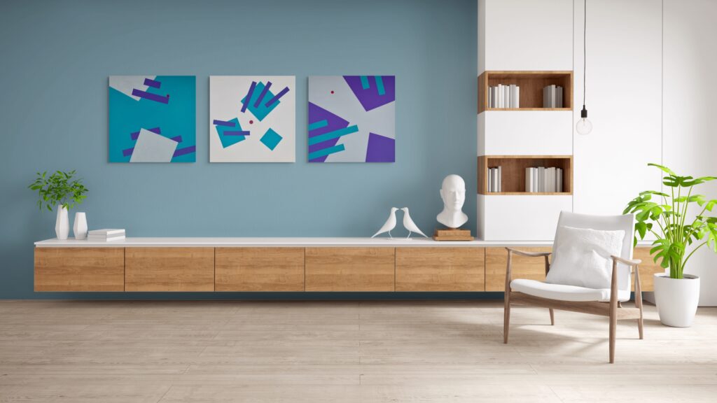
Colour Influences Our Emotions and Behaviours: Creating Intentional Mood Zones with Art
The most powerful application of colour psychology comes through intentional zone creation. Rather than treating an entire home with a single approach, identify the emotional purpose of each space and select art accordingly.
#1 Energizing Spaces (Office, Kitchen, Gym)
Rooms meant for activity, productivity, and energy benefit from:
- Warm tones and warm colours in strategic locations
- Bold hues and vibrant colours as accents in artwork
- Triangular or diagonal geometric elements
- Higher contrast colour combinations
- Different shades of orange, coral, and certain yellows
The ideal wall colour in a home gym might be a neutral background that allows energising art to stand out. A geometric canvas with red-orange geometric blocks can serve as a visual “go” signal during workouts.
Kitchens, especially those used for morning routines, respond well to golden shades and warm colour yellow that simulate morning light. The colour yellow particularly suits breakfast nooks, where it can lift energy without overwhelming.
#2 Calming Zones (Bedroom, Bath, Reading Areas)
Spaces for rest and recovery need:
- Cool, neutral colours as the foundation
- Lower saturation levels
- Softer geometric forms (if any)
- Monochromatic schemes or analogous colour palette choices
- Blues, greens, lavenders, and soft pinks
#3 Social Areas and Conversation Pieces
Living rooms, dining rooms, and entertainment spaces balance multiple needs:
- They should welcome and energise
- But not exhaust guests
- They should spark conversation
- While feeling comfortable for extended stays
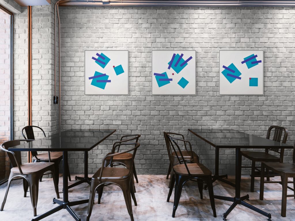
Approach these spaces with a neutral colours palette as the foundation, then introduce conversation-starting art with more complex colour relationships. A geometric painting using a triadic colour scheme (three colours evenly spaced on the colour wheel) creates enough visual interest to spark discussion without overwhelming the space.
Dining rooms particularly benefit from warm, appetite-stimulating colours. Terracotta, burnt orange, and other warm colours work well here. Use colours that make food look appealing and encourage lingering over meals.
Psychological Profiles of Key Colours in Art and Interiors
This section serves as a concise palette guide, connecting how each colour functions in interior design.
#1 Blue: Calm Focus and Depth
- Produces reliable psychological effects: lower perceived temperature, slower pulse, and associations with sky and water
- Ideal for clients seeking rest and reflection
Interior design applications:
- Blue is productive and calming, lowers blood pressure and heart rate, and is ideal for offices and relaxing spaces.
- Pale blue-grey walls in bedrooms and bathrooms
- Deep navy cabinetry in kitchens (balanced with warm brass to avoid coldness)
- Teal in home offices for sustained concentration
- Royal blue as a dramatic accent in otherwise neutral rooms
Caution:
- Too much cold blue in poorly lit rooms feels clinical. Balance with textured woods, warm textiles, or warmer accent colours.
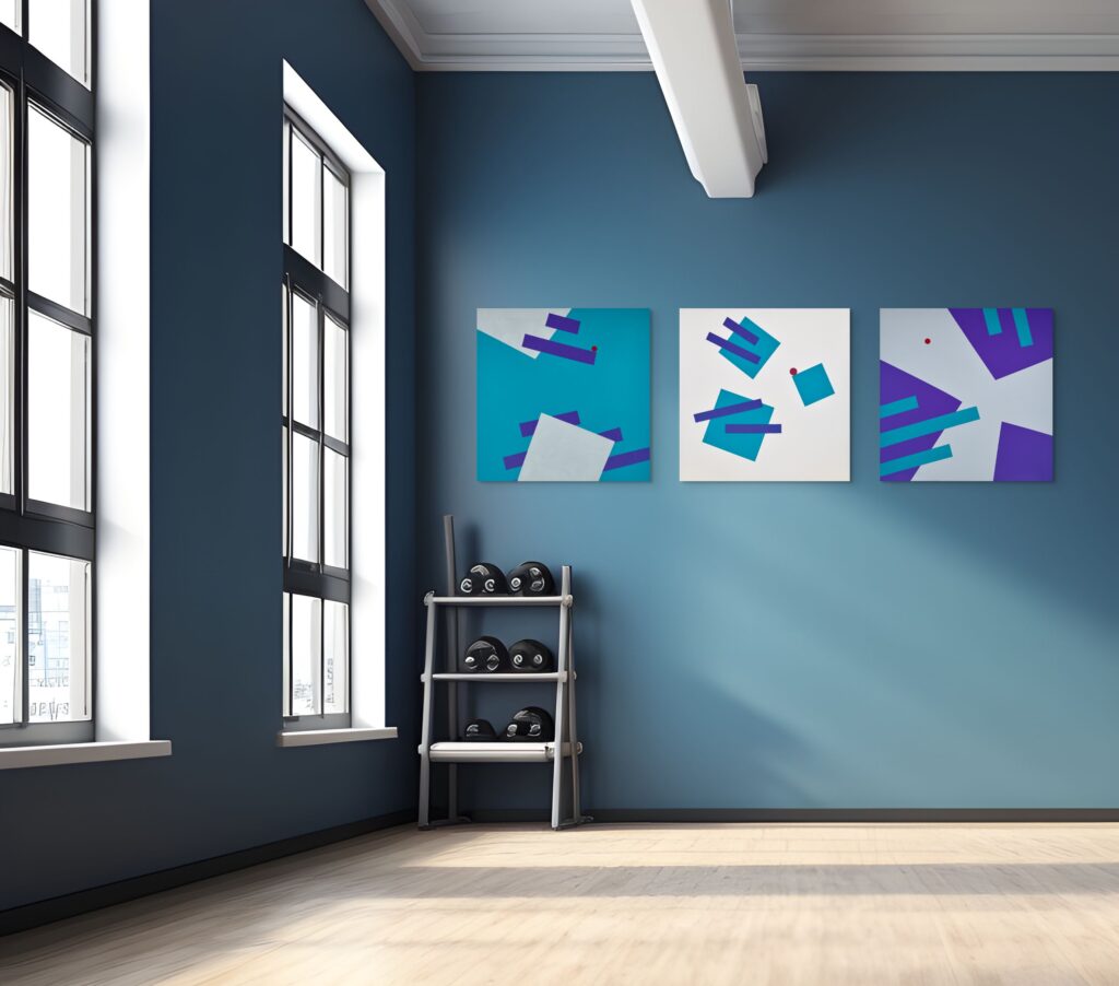
#2 Green: Balance, Renewal and Creative Flow
- Connects us to the natural world, triggering associations with safety, growth, and renewal
- Linked with reduced stress and mental fatigue
Interior design applications:
- Green represents nature, balance, and growth, reduces eye strain, and is suitable for studies or refreshing areas.
- Green in the workplace has been shown to increase creativity by up to 15% and improve productivity by 6%.
- Sage or olive walls for living rooms and kitchens
- Deep forest green (dark green) in library corners
- Muted mint in children’s rooms and hallways
- Green furniture upholstery for a nature-connected feel
Enhancement:
- Combine green walls with indoor plants, natural linen, and stone to strengthen the restorative effect.
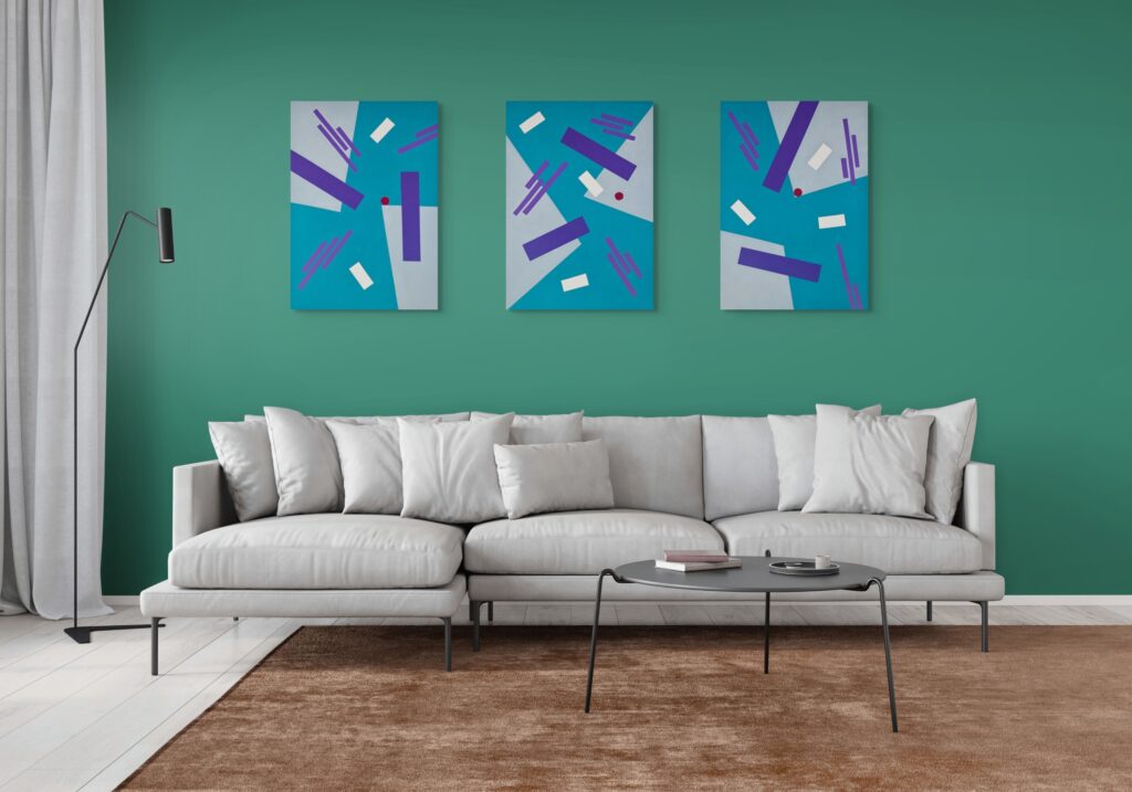
#3 Red: Energy, Passion and Cautious Accent
- Red is often linked with passion, excitement, and energy, and can stimulate appetite and increase heart rate.
Interior design applications:
- Red stimulates appetite and energy, best used as an accent in dining rooms. Use sparingly: a single vermilion feature wall in dining areas
- Crimson rugs under tables
- Red dining chairs as focal points
- Deep, muted reds (brick, oxblood, burgundy) for sophistication
Caution:
- Avoid full red rooms. A dark shade of red (burgundy, wine) feels more cocooning than bright scarlet, especially in evening-use spaces.
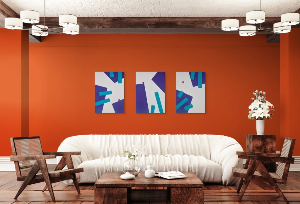
#4 Yellow: Light, Optimism and Mental Alertness
- Yellow associates with sunlight, optimism, and quick mental processing
- Strong lemon yellows can cause agitation if overused
Interior design applications:
- Buttery yellow for kitchen walls to brighten grey mornings
- Golden ochre cushions in living rooms
- Narrow yellow stripes around studio ceilings to lift focus
- Pastel yellow in little girls rooms or sunny nurseries
Recommendation:
- Prefer muted, earthy tones of yellows (mustard, honey, straw) for large areas. Save intense yellows for small accents.
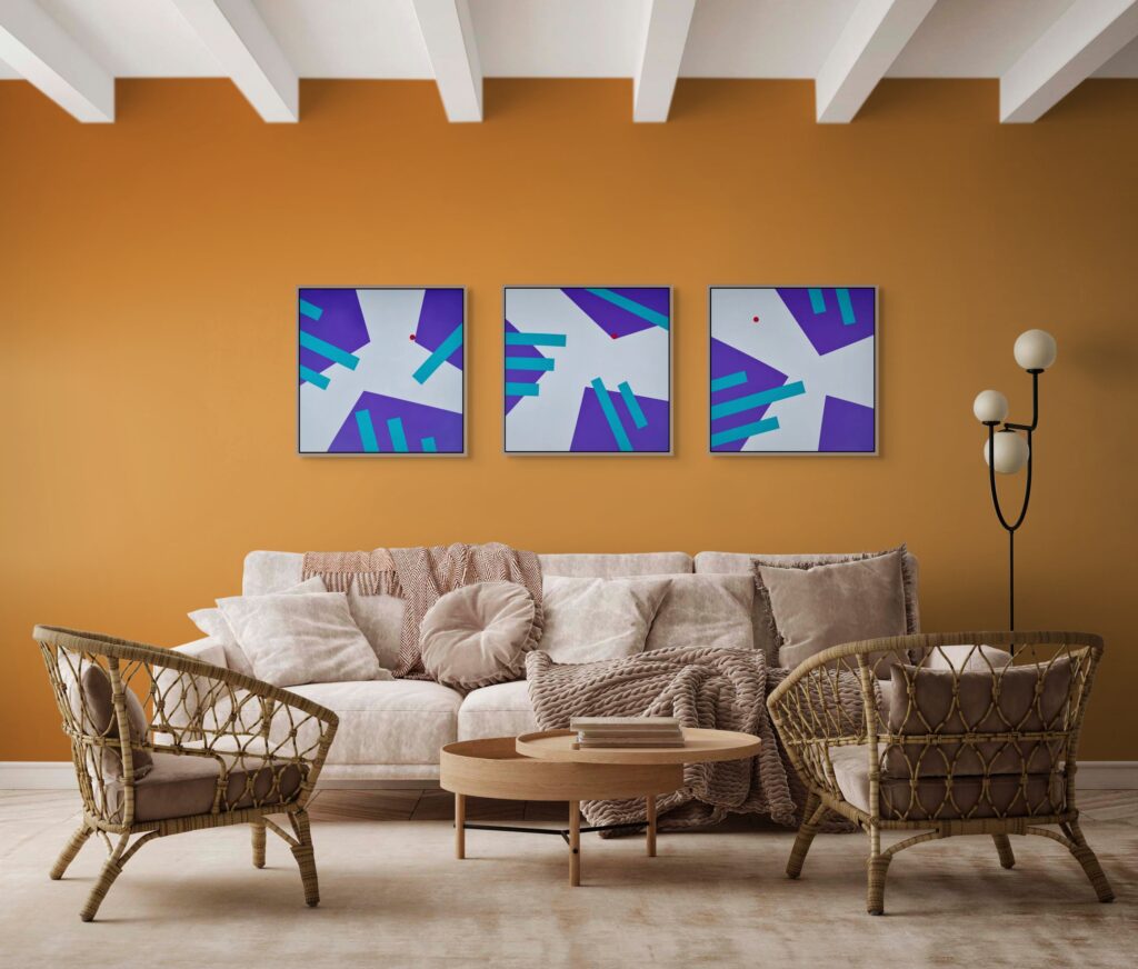
#5 Orange: Energy, Warmth and Emotional Stimulation
- Orange is associated with warmth, enthusiasm, and emotional vitality
- Bright or overly saturated oranges can feel overwhelming or overstimulating when used excessively
Interior applications:
- Terracotta tiles in kitchens and hallways
- Burnt orange throws in living areas
- Pumpkin-coloured accent walls in dining nooks
- Golden shades for a welcoming atmosphere
Warning:
- Avoid neon or highly saturated oranges, which overwhelm. Choose earthy, sun-baked variants inspired by Mediterranean architecture.
#6 Purple: Imagination, Drama and Transition
- Purple evokes creativity and luxury, combining stability and energy from blue and red.
- Carries historical associations with rarity, spirituality, and luxury
- Feels both introspective and theatrical, depending on depth and pairing
Interior design applications:
- Deep aubergine for small powder rooms or stairwells
- Soft lilac for restful, creative bedrooms
- Purple accents in reading corners
- Different shades of violet for transitional spaces
Advice:
- Pair purple with plenty of neutrals or natural materials to avoid an overly ornate appearance.
#7 Pink: Softness, Care and Modern Ease
- Evolved beyond stereotypically feminine associations
- Contemporary use emphasises warmth, kindness, and modern ease
Interior design applications:
- Pink is associated with compassion, love, and calmness, making it a versatile shade for living room décor.
- Plaster pink or blush on living room walls (flatters skin tones)
- Deeper rose on upholstery for depth
- Coral accents in social spaces
- Pink in hallways for gentle welcome
Note:
- Overly saturated pinks can feel childish. Use them only as intentional accents in playful contexts.
#8 Neutral Colours: Grey, Brown, Black and White as Grounding the Palette
- Neutrals function as “pause marks” in both interior design and paintings
- Give the eye rest and make stronger hues feel intentional rather than chaotic
- Lighter colours make a room appear more spacious, while darker tones create intimacy and coziness.
Whites and creams:
- Backgrounds for art and furniture
- Too pure can feel stark – use lightly tinted whites tailored to natural light
Greys:
- Quiet, modern frameworks reading warm or cool based on undertones; essential for monochromatic schemes
Browns and wood tones:
- Comfort and trust – walnut tables, oak floors, tan leather stabilise brighter accents
Black and charcoal:
- Powerful definition tools. Thin black lines structure compositions. In interiors, dark shades of black window frames, lamps, and picture frames add clarity.
- Black is associated with sophistication and power, but can evoke feelings of intimidation if overused.
A neutral palette doesn’t mean boring. The right colours in neutral territory, warm taupes, cool greys, creamy whites, create sophisticated backdrops for life and art. Cool colours like blue, green, and purple promote calmness, relaxation, and tranquility, suitable for bedrooms and workplaces requiring concentration.
Colour Combinations and Geometric Composition
Individual colours matter, but their relationships, like chords in music, determine the real emotional effect and how these colours affect specific emotions.
Natural light changes throughout the day, affecting colour perception – cool in the morning and warm in the afternoon. Evaluating colour combinations under specific lighting conditions is crucial, as different light sources can significantly alter how hues interact.
This section covers practical pairing methods and how they translate between canvas and room.
#1 Monochromatic and Minimal Palettes
Monochromatic schemes use variations of one hue: many blues, various greens, or layered greys. They produce calm and cohesion, perfect for bedrooms, meditation rooms, and minimalist living spaces.
#2 Analogous and Complementary Colour Schemes
Analogous schemes use neighbouring hues (blue–green–teal). They’re naturally harmonious and suit relaxed living rooms and bedrooms with visual depth.
Complementary schemes use opposite bold colours on the colour wheel (blue and orange, red and green). Higher tension, higher energy. Excellent for dining rooms, creative spaces, and entryways.
#3 Triadic Palettes and the 60-30-10 Rule
Triadic palettes use three evenly spaced colours (red–yellow–blue or orange–green–purple). Vibrant and playful, they require careful proportion to avoid visual noise.
The 60-30-10 rule provides structure:
- 60% main colour (walls, large surfaces)
- 30% secondary (major furniture, rugs)
- 10% accent (art, cushions, lamps)
Familiarity with different colour schemes allows designers to design cohesive spaces that support targeted emotional effects.
🖼️ Quick Quiz: Colour, Mood, and Interior Design
Test your understanding of how colour influences mood and interior ambiance.
Question 1 of 3
Which colour is most commonly associated with calming effects in interior spaces?
Why can warm colours like red and orange increase energy levels in a room?
What is one key way colour impacts how we experience a space?
Practical Application: Choosing Colour in Interior Design and Art for Wellbeing
Colour psychology knowledge only matters if it translates into action. This section guides you through selecting art that genuinely supports your emotional needs.
#1 Assessing Your Space’s Emotional Needs
Before choosing any artwork, follow these steps:
- Ask: “What should this space make me feel?”
- Write down three adjectives (e.g., restful, safe, quiet for a bedroom; focused, energised, clear for a home office; warm, social, comfortable for a living room).
- Use these adjectives to guide every subsequent decision.
- Consider:
- What activities happen here?
- What time of day is it most used?
- Who uses it? (Individual preferences, children, guests)
- What are the current lighting conditions?
If your bedroom needs to feel “quiet,” a large red geometric canvas, however beautiful, probably isn’t the right colour for that wall.
#2 Balancing Stimulation and Relaxation through Complementary Colours
Most homes need zones for both. The mistake is treating the entire home uniformly.
Stimulating zones (offices, kitchens, exercise areas):
- Higher contrast art
- Warm or mixed temperature palettes
- More complex geometric forms
- Brighter colours in accent quantities
Relaxing zones (bedrooms, reading areas, bathrooms):
- Lower contrast, analogous colour schemes
- Cooler or softer warm temperatures
- Simpler geometric forms or organic shapes
- Lighter hues dominating
The transition between zones matters too. Hallways and entryways can bridge stimulating and calming areas through intermediate colour temperatures and moderate complexity.
#3 Personal Preference vs. Psychology Principles
Psychology provides starting points, not mandates. If you love orange but the “rules” say use blue in your bedroom, there are ways to honour both:
- Use the beloved colour in smaller doses (accent pillows, small artwork)
- Choose muted versions (burnt sienna instead of neon orange)
- Combine it with its complementary colour for balance
- Reserve it for transitional spaces where psychological precision matters less
I suggest choosing intense colours you love on canvases rather than walls in your own home. This lets you move them, rotate them, or rest from them when your emotional state shifts.
Summary: Using Colour to Shape Space and Mood
Colour is not decoration, it’s communication and wellness factor. Every colour choice sends signals that influence mood, shape behaviour, and affect wellbeing. As a geometric artist, I’ve seen how the right colours in the right proportions transform how people feel in their homes and offices.
Colour psychology studies how different hues influence human behavior, mood, and perception. Effective colour schemes form the foundation of successful interior design. Knowing how colour schemes work helps designers create balanced spaces that encourage specific emotional responses.By applying these principles, both homeowners, artists and designers can intentionally shape the ambiance and function of any space.
Art and interior design share the same goal: creating environments where humans thrive. Understanding colour psychology transforms both practices from aesthetic exercises into genuine wellbeing interventions.
What Mood Do You Want Your Interiors to Create?
Transform Your Space with Uplifting Art
Browse my collection of mood-boosting geometric paintings.
FAQ - Frequently Asked Questions

Unlocked. Congratulations!
Use code ADRA10 at checkout.
Only available the next 1 hour.
Your Discount for Mood-Boosting Art is Waiting
Enter your email to unlock your one-time discount.
By signing up, you’ll receive curated emails with early collection access and interior art styling tips. Unsubscribe anytime.