What Are the Best Art Colours for Grey Walls? A Homeowner and Interior Designer’s Expert Guide to Geometric and Abstract Canvas Art for Modern Homes
Table of Content
Grey walls are the chameleon of interior design – sophisticated, timeless, and incredibly versatile. But what are the best art colours for grey walls? Grey is a go to shade for modern interiors due to its adaptability with various paint colours. Yet that beautiful blank, grey painted walls can also feel surprisingly boring. A carefully curated gallery wall featuring paintings, smaller prints and photographs provides variety and rhythm, making the room feel more dynamic and lived-in. You may be wondering what colour art works best with grey walls without making a space feel cold or mismatched. You’re in the right place.
Many homeowners look for grey inspiration when selecting art and paint colours for their homes. The secret isn’t simply choosing a colour palette you like. It’s about selecting wall art that complements your specific shade of grey and brings your room to life. Choosing the right art colours can transform grey walls from cold and bland to warm and inviting, making a significant impact on your home’s atmosphere.
As an architect and geometric abstract painter, I believe original geometric art is one of the most powerful ways to inject personality and energy into modern interiors with grey painted walls. This guide is designed for homeowners, interior designers, and anyone styling a contemporary space who wants expert-led advice on choosing artwork that transforms grey walls from neutral to truly breathtaking.
Discover the Interplay Triptych and explore the full series or select individual panels for more inspiration and to bring dynamic colour and harmony into your space.
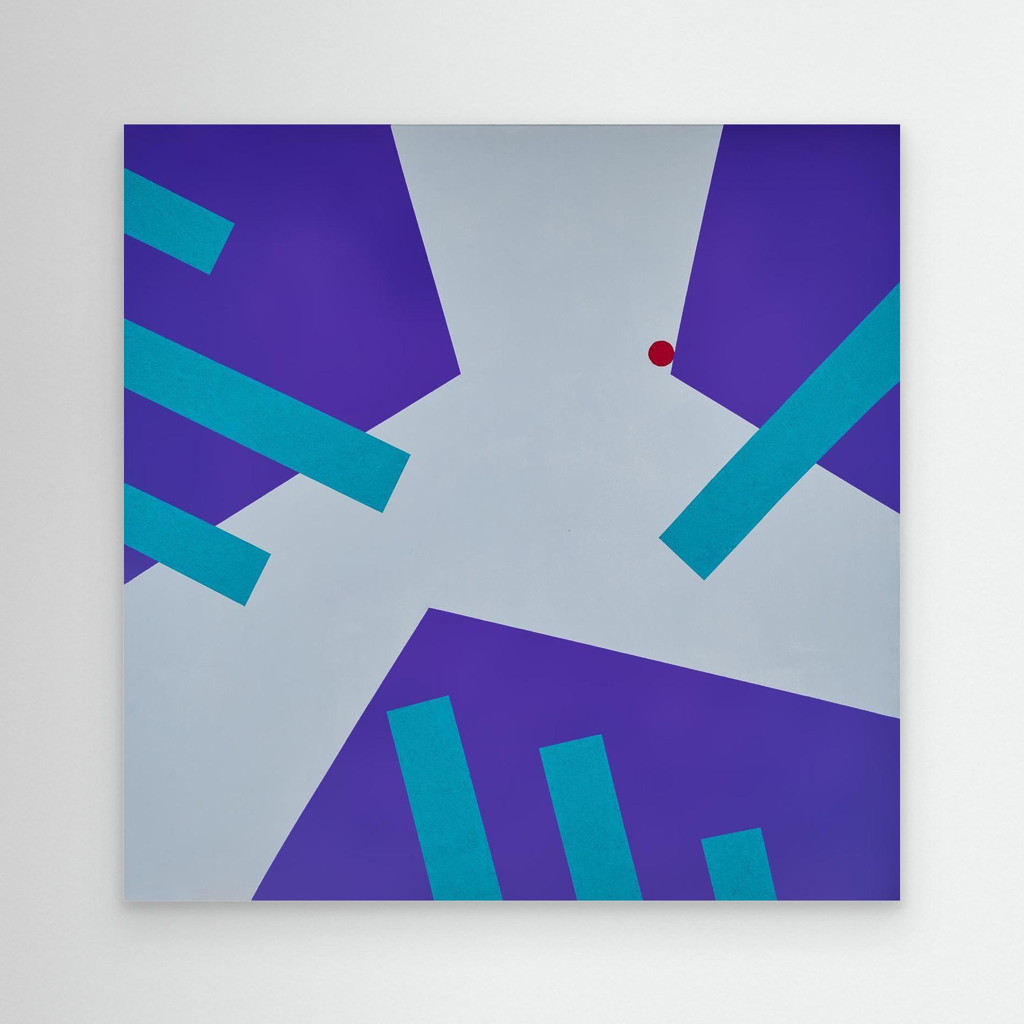
Interplay: Exploring
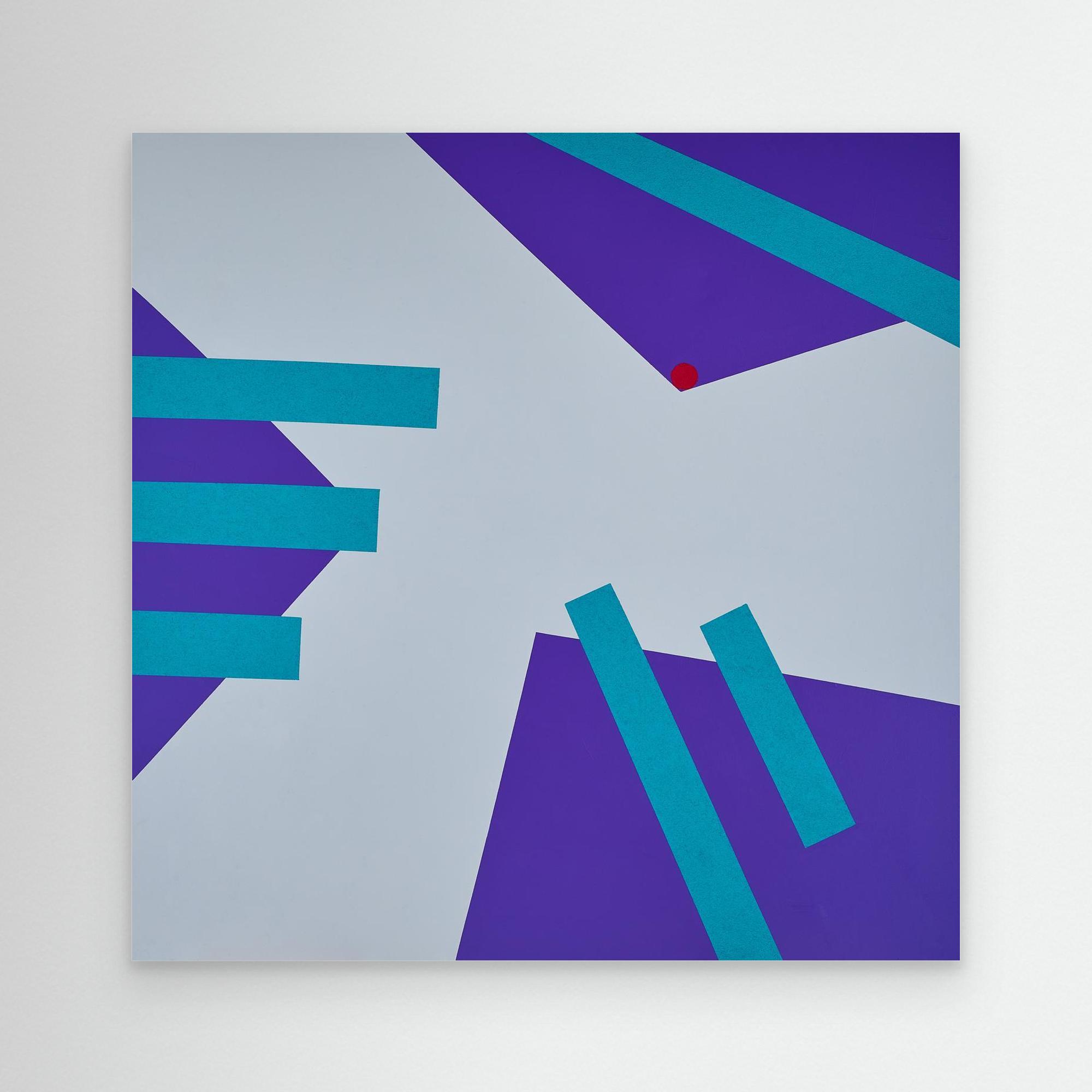
Interplay: Calling
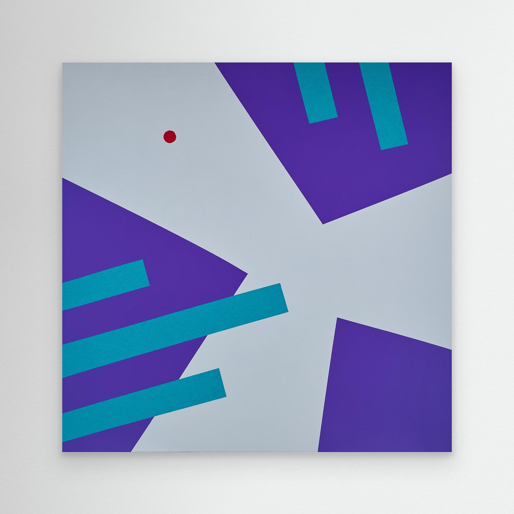
Interplay: Becoming
Choosing the Right Shade of Grey for Your Walls
Selecting the perfect grey paint for your walls is more than picking a neutral tone – it’s about understanding undertones, lighting, and how the shade interacts with your furnishings and décor. Light greys create a calming atmosphere ideal for minimalist or Scandinavian-inspired spaces, while dark greys bring depth and drama. Grey creates a versatile and stylish foundation that works well with a variety of colour schemes, allowing you to tailor the overall aesthetic to your personal taste.
Natural and artificial light can dramatically shift the perception of grey, so always test paint samples in the room at different times of day. Consider the colours of your furniture, wall art, and textiles: a deep charcoal can make vibrant accent colours pop, while a pale dove grey offers a serene backdrop for layered textures. By observing how your chosen grey paint colours work with light and surrounding elements, you can ensure your colour choice feels cohesive and intentional, providing a harmonious, timeless foundation for any interior style.
Understanding the undertone of your grey and the light levels of your room is key to getting the colour right. Choosing the right grey hue depends on the natural and artificial light in the room, as well as the furniture and decor. To keep a balanced look, follow the 60/30/10 rule, using grey as the main colour and adding complementary tones in smaller amounts.
#1 Light Grey: Bright, Airy, and Versatile
Light grey walls create a sense of openness and serenity, making rooms feel larger and more inviting. These shades work beautifully in spaces that receive plenty of natural light, reflecting it softly and enhancing a bright, airy atmosphere. Light grey acts as a neutral canvas, allowing you to experiment with bold or subtle accent colours, patterned textiles, and various art styles. Soft blues, muted yellows, light blue, or sage greens pair exceptionally well, while white or natural wood furnishings maintain a clean, contemporary look. Soft blush pink and dusky grey provide a romantic, modern pairing ideal for calming spaces. Because light grey is so versatile, layering different grey tones with light blue accents can create a harmonious and inviting space that adapts seamlessly to modern, Scandinavian, or minimalist décor styles.
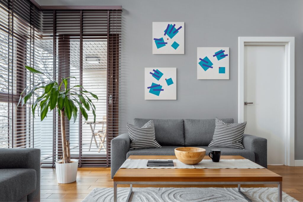
#2 Dark Grey: Dramatic, Cozy, and Sophisticated
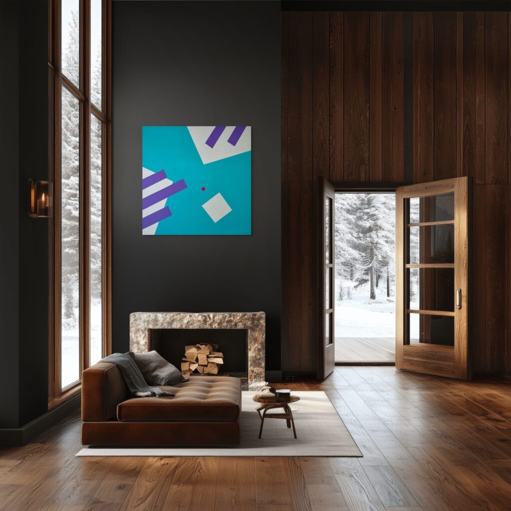
Dark grey walls add depth, sophistication, and a cozy, intimate feel to a space. Dark grey is also perfect for adding drama to interiors, especially when layered with contrasting materials, glazing, or backlighting for a more impactful atmosphere. They work particularly well in larger rooms, dining areas, or bedrooms, where a moody atmosphere is desired. Dark grey can show less wear and tear than lighter shades, making it practical for high-traffic areas. Dark grey pairs beautifully with vibrant accent colours – mustard yellow, burnt orange, or rich jewel tones pop against the deeper backdrop – while metallics like gold or brass add elegance and warmth. Furniture in lighter shades, wood tones, or soft textiles can balance the intensity, preventing the space from feeling too heavy. Deep charcoal or gunmetal grey is ideal for contemporary, industrial, or modern classic interiors where a statement wall or dramatic effect is desired.
Below you can find best abstract and geometric art colours for grey wall shades:
Shade of Grey Wall | Abstract / Geometric Art Colour | Visual Effect | Psychological Impact | Light grey | Soft blue geometry | Adds depth without visual weight | Calm, mental clarity |
|---|---|---|---|
Light grey | Muted yellow accents | Creates gentle contrast | Optimistic, alert |
Mid grey | Deep green geometry | Grounds the space | Restorative, balanced |
Mid grey | Terracotta or rust shapes | Warms cool surfaces | Energising, inviting |
Dark grey | White or off-white minimal forms | Sharp contrast, modern | Focused, composed |
Dark grey | Blush or dusty pink abstraction | Softens intensity | Calm, emotionally warm |
Any grey | Black-and-white geometric patterns | Enhances rhythm and order | Stable, harmonious |
At this point, you’re ready to consider how your specific shade of grey will interact with different art colours and styles.
Understanding Your Grey Walls: Warm vs Cool Undertones
Before choosing any wall art, it’s essential to understand the grey on your walls. Not all greys are the same. Most contain a subtle undertone that falls into one of two categories: warm or cool. Identifying this undertone is key to selecting art that feels harmonious rather than jarring, and it’s what separates a thoughtfully designed interior from one that feels slightly off.
A simple way to identify your wall colour’s undertone is the paper test. Hold a clean sheet of bright white paper against the wall. When viewed side by side, your grey’s underlying warmth or coolness will become immediately more noticeable. Warm greys, with subtle hints of beige, red, or yellow, create a cozy, inviting atmosphere, while cool greys, with blue or green undertones, feel crisp and modern.
If you’re unsure about undertones or want to ensure you select the best paint colours for your space, an interior designer can help you identify the right shades and create a cohesive look.
#1 Add Warmth through Beige, Cream and Brown Accents
Warm greys have a soft, welcoming feel and often carry hints of beige, cream, or brown. These shades work beautifully in cosy, layered interiors and pair well with artwork that enhances their warmth. Incorporating natural materials like wood or rattan can bring warmth to the space, making it feel even more inviting. A classic example is Benjamin Moore’s Grey: Revere Pewter.
Warm greys can be achieved by incorporating yellow or red ochre undertones to avoid a cold feel, and natural materials further bring warmth to warm grey rooms.
#2 Add Coolness through Blue, Green and Violet Undertones
Cool greys, by contrast, feel crisp, airy, and distinctly modern. They tend to show subtle blue, green, or even violet undertones, making them ideal for contemporary spaces. Repose Gray by Sherwin-Williams is a popular cool-leaning grey that suits clean-lined interiors and modern artwork particularly well.
Pair warm greys with warm-coloured art, and cool greys with cool-toned art.
Once you’ve identified your wall’s undertone, you’re ready to explore which art colours will best complement your space.
Best Art Colours for Grey Walls: Five Proven Palettes
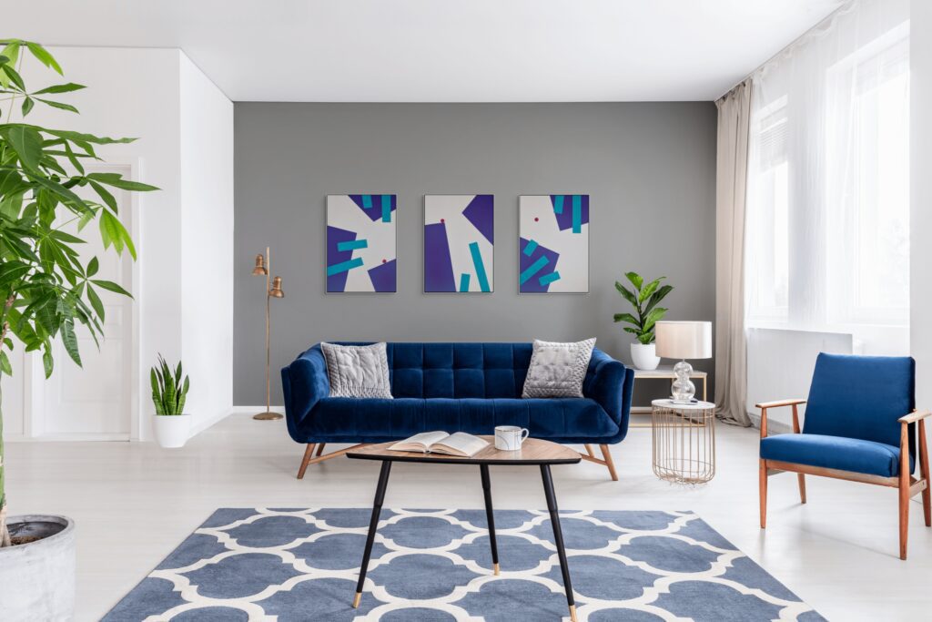
The best art colours for grey walls are those that provide contrast, warmth, and visual interest. Artwork featuring mustard yellow, teal, emerald green, or burnt orange provides the best contrast to brighten and warm up grey walls. Navy blue and other shades of blue create a tranquil, serene feel. These palettes are supported by interior design research and are proven to enhance the look and feel of grey-walled spaces.
#1 Jewel Tones: Bold Art for Grey Living Rooms
If you’re looking to introduce drama and a sense of luxury, jewel tones are a timeless choice like emerald green, deep teal, and magenta add a striking, modern, and high-energy feel to a room. Rich, saturated colours stand out beautifully against grey walls, creating a striking focal point while still feeling refined rather than overpowering. Emerald or forest green with wood tones creates a serene and elegant atmosphere. Jewel tones can also be used to create focal points in a grey living room, drawing attention to specific areas or features and enhancing visual interest.
Palette:
- Emerald green (#009B77)
- Sapphire blue (#0F52BA)
- Deep burgundy (#800020)
Best suited for: Living rooms, dining areas, and entrance halls where you want to make a confident visual statement.
Designer tip: Limit your artwork to one or two jewel tones to maintain visual balance. Pieces with layered textures, movement, or subtle tonal variation will add depth without overwhelming the space.
#2 Soft Pastels: Calming Art for Grey Bedrooms
For a space that feels calm, restorative, and effortlessly elegant, soft pastel artwork pairs beautifully with grey walls. These delicate hues soften the neutrality of grey, creating a light, airy atmosphere that encourages relaxation without feeling overly sweet or juvenile. Grey works brilliantly in bedrooms because it naturally feels calm and understated. Soft blush pink and dusky grey provide a romantic, modern pairing ideal for calming spaces. Blue is one of grey’s most versatile partners, enhancing its calm feel.
Palette:
- Blush pink (#F1C4C4)
- Soft mint (#BDECB6)
- Baby blue (#C9E2F3)
Best suited for: Bedrooms, nurseries, and bathrooms where a sense of quiet comfort and visual calm is key.
Designer tip: Choose artwork with clean lines and restrained compositions. Simple geometric forms and subtle colour transitions will reinforce the minimalist, tranquil quality of this palette while keeping the space feeling considered and refined.
#3 Earthy Neutrals: Natural Art for Warm Grey Walls
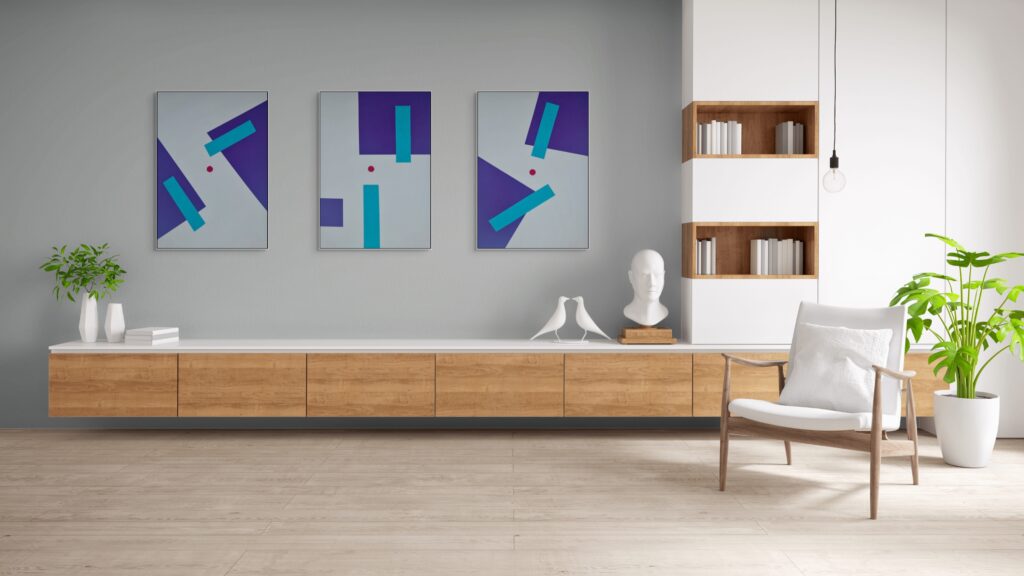
If your grey walls lean warm, an earthy, neutral palette will enhance their natural depth and create a space that feels grounded and welcoming. Large, bold, abstract, or landscape art works particularly well on grey to add personality. Burnt orange, mustard yellow, and deep reds create an inviting contrast to grey walls. Mustard yellow, gold tones, and warm earthy colour like terracotta or burnt orange prevent grey from feeling cold. This colour palette is often used on feature walls to add depth and visual interest, making it a great choice for creating a focal point in the room. Mustard yellow adds energy, balancing the coolness of grey walls, and works especially well with darker greys. Mustard yellow and charcoal black offer a striking modern contrast. Olive green works well with grey because it adds richness without overpowering it.
Shades inspired by nature pair beautifully with warm greys, especially when combined with wood finishes, stone, and tactile materials.
Palette:
- Warm beige (#DDCDBA)
- Taupe (#483C32)
- Terracotta (#E2725B)
Best suited for: Family rooms, home offices, and interiors that feature natural textures and materials.
Designer tip: This palette is ideal for textured artwork. Look for wall art with visible brushstrokes, layered surfaces, woven details, or mixed media to add depth and warmth without relying on strong colour contrast. Texture can be added through canvas prints, framed items with wood tones, or metallic accents.
#4 Black and White Art: A Modern Look for Any Grey Paint Tone
Timeless, versatile, and effortlessly refined, black and white wall art works with virtually every shade of grey. This monochrome approach highlights contrast, form, and composition, making it a reliable choice for both contemporary and classic interiors.
Palette:
- Pure white (#FFFFFF)
- Soft off-white (#F8F8F8)
- Deep black (#000000)
Best suited for: Any room, particularly minimalist, modern, or industrial-style spaces.
Designer tip: Framing plays a crucial role. Black frames create a bold, graphic effect, while white frames offer a softer, more seamless look. Larger-scale pieces can be especially impactful against grey walls, so don’t shy away from statement sizes.
#5 Bright Geometric Art: Energising Colour Schemes for Cool Grey Walls (Blush Pinks, Oranges etc.)
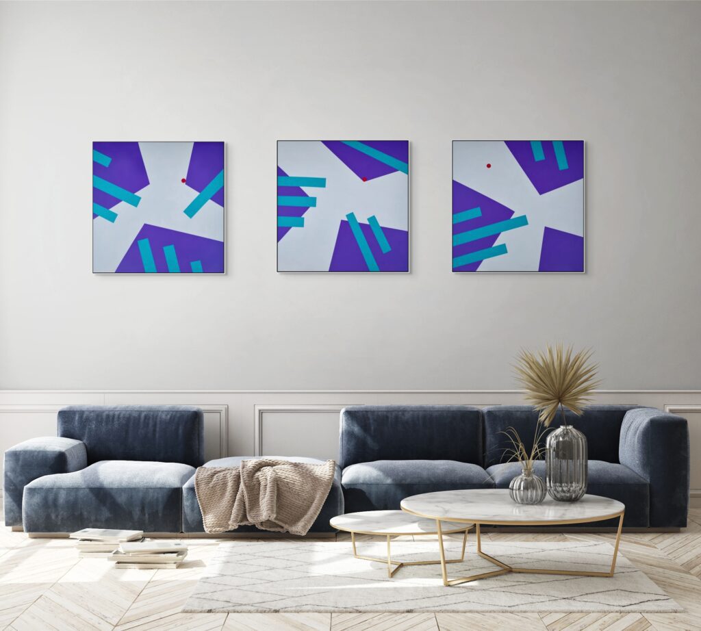
If you’d like to introduce energy and personality, bright geometric artwork is an excellent counterpoint to cool-toned grey walls, whereas cushions and throws in vibrant colors can add a playful touch to a grey sofa. Bold art can transform grey walls into vibrant, engaging features, making them stand out as stylish centerpiece in your space. Bold colours bring vibrancy, while geometric structure keeps the overall look balanced and intentional rather than overwhelming. Blush or hot pink creates a warm, striking contrast against grey. Using red sparingly in wall art adds warmth and creates a high-impact attention point in a neutral space.
Palette:
- Bright coral (#FF7F50)
- Teal (#008080)
- Mustard yellow (#FFDB58)
Best suited for: Home offices, kitchens, playrooms, and creative spaces.
Designer tip: Echo one colour from the artwork in a small accent, such as a cushion, vase, or desk accessory, to visually connect the art with the rest of the room.
With these palettes in mind, you can now focus on how to select, size, and display your chosen artwork for maximum impact.
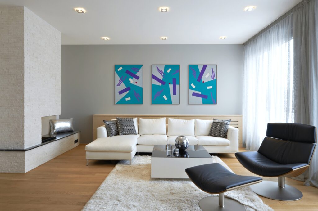
How to Choose and Hang Art on Grey Walls
Selecting the right colours is only part of the process. Scale, framing, and texture play an equally important role in how artwork sits within a space. When these elements are considered together, wall art feels intentional rather than simply decorative. The right wall art can enhance the look of grey walls and tie the room together, adding warmth and personality.
#1 Choosing the Right Size Artwork for Grey Walls
Proportion is everything. Artwork that’s too small can feel insignificant, while oversized pieces may dominate the room. These two simple guidelines will help you strike the right balance:
- The two-thirds rule: When hanging wall art above furniture such as a sofa, grey sofa, sideboard, or console table, aim for a piece (or group of pieces) that spans roughly two thirds of the furniture’s width. For example, above a 9-foot sofa, your artwork should be around 6 feet wide.
- The 57–60 inch rule: Hang artwork so that its centre sits approximately 57 to 60 inches from the floor. This aligns with average eye level and is the standard height used in galleries, ensuring your art feels comfortable to view.
#2 Choosing Frame Colours for Grey Walls
The right frame helps anchor artwork within the room and tie it into the surrounding décor. Consider coordinating the frame colour with other furniture pieces like a sofa, sideboard, or console table, or bar stools in a kitchen.
- Black frames create strong contrast and a bold, graphic look that works particularly well in modern interiors.
- White frames offer a clean, contemporary feel, allowing the artwork itself to take centre stage.
- Wood frames introduce warmth and an organic quality, making them especially effective for softening cooler grey walls.
- Metallic frames, such as gold or silver, add subtle glamour and help reflect light around the space.
#3 Adding Textures to Artwork on Grey Walls
Grey walls can occasionally feel flat if everything around them is smooth and uniform. Introducing textured artwork adds depth and visual interest, bringing the wall to life. Textured wall art can also be used to highlight architectural features in a room, drawing attention to unique curves or proportions and enhancing the overall design. Consider original oil or acrylic paintings with visible brushstrokes, woven or textile-based wall pieces, or prints with metallic or foil details that catch and reflect the light.
With your art selected and ready to hang, you can now focus on creating a stunning attention point in your room.
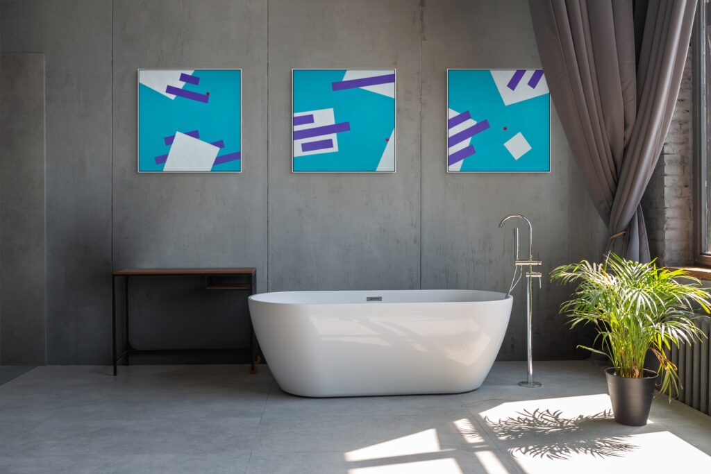
Creating a Focal Point with Art on Grey Walls
Grey walls are the perfect backdrop for creating a stunning focal point in any room. Their versatility allows you to showcase a wide range of art pieces, from bold and saturated colours to soft and subtle hues, making it easy to reflect your personal taste and style. The key to transforming grey walls lies in choosing the right colour palette and art style to add depth and visual interest.
To make your artwork pop, consider the undertones of your grey paint. Cool greys with blue or green undertones pair beautifully with art featuring soft blues, pale greens, or even deeper teal shades, creating a calming and cohesive look. On the other hand, warm greys with hints of beige or brown accents are enhanced by art pieces in warm tones like burnt orange, mustard yellow, or rich earthy hues. These warm colours add energy and warmth, preventing the space from feeling cold and bringing a sense of balance to the room.
For maximum impact, use a large statement piece or create a gallery wall with varying shapes, sizes, and frame styles. A gallery wall featuring a mix of artwork in different shades and textures can add visual interest and make the whole room feel more dynamic. If your space features pale grey walls and soft furnishings, opt for art in gentle tones like blush pink, soft blues, or pale greens to maintain a serene atmosphere. In rooms with darker shades of grey, bolder and more saturated colours create a striking contrast and draw the eye, instantly establishing an attention point.
Texture also plays a crucial role in adding depth and visual interest. Mixing frame materials, such as wood, metal, or even velvet, can introduce warmth and tactile appeal, while textured art pieces bring dimension to otherwise flat grey walls. Whether you prefer a cohesive look with similar tones or a more eclectic mix, experimenting with different styles and textures can make all the difference in creating a space that feels curated and inviting.
Ultimately, creating an attention point with art on grey walls is about finding the perfect balance between colour, texture, and scale. Don’t be afraid to combine grey with warm hues, cool tones, or even unexpected pops of colour. With so many shades of grey to choose from, your walls can become a canvas for creativity, allowing you to add depth, visual interest, and personality to your living room, cosy reading nook, or any space in your home. Let your artwork transform your grey walls into a true reflection of your unique style.
Now that you know how to create an attention point, let’s break down the steps to choosing the perfect art for your grey gallery walls.
🖼️ Best Art Colours for Grey Walls Quiz
Test your understanding of how art colours interact with grey walls.
Question 1 of 3
Which accent colour works well with grey walls for a lively feel?
Why is grey considered a perfect backdrop for artwork?
How can you make a grey room feel warmer using art?
Three Steps to Choosing the Perfect Art for Your Grey, Gallery Walls
Ready to get started? Use these simple, practical tips to guide your decision-making and ensure your artwork feels perfectly suited to your space.
#1 Identify Your Grey’s Undertone
Use the white paper test to determine whether your walls lean warm or cool. This step forms the foundation for every other choice you make.
#2 Choose Your Colour Palette and Mood
Decide on the atmosphere you want to create. Are you drawn to dramatic jewel tones, calming pastels, or energising brights? Explore curated collections, such as minimalist geometric art, to refine your preferences and gather inspiration, and seek grey inspiration from design magazines or online galleries.
#3 Measure for the Right Size
Before committing to a piece, confirm the dimensions using the two-thirds width rule and the 57-inch centre rule. Getting the scale right ensures your artwork feels balanced and intentional within the room.
With these steps, you’re ready to bring your grey walls to life with art that truly reflects your style.
Bringing Grey Walls to Life with the Right Art
Grey walls provide the perfect neutral canvas, but it’s your choice of artwork that truly brings a room to life. By understanding your grey’s undertone, selecting a complementary palette, and considering scale, framing, and texture, you can transform ordinary walls into a striking, personal statement. Geometric and abstract art adds movement, depth, and character, making modern interiors feel curated, expressive, and entirely your own.
Are You Ready to Elevate Your Grey Walls with Art?
Transform Your Space with Uplifting Art
Browse my collection of mood-boosting geometric paintings.
FAQ - Frequently Asked Questions

Unlocked. Congratulations!
Use code ADRA10 at checkout.
Only available the next 1 hour.
Your Discount for Mood-Boosting Art is Waiting
Enter your email to unlock your one-time discount.
By signing up, you’ll receive curated emails with early collection access and interior art styling tips. Unsubscribe anytime.